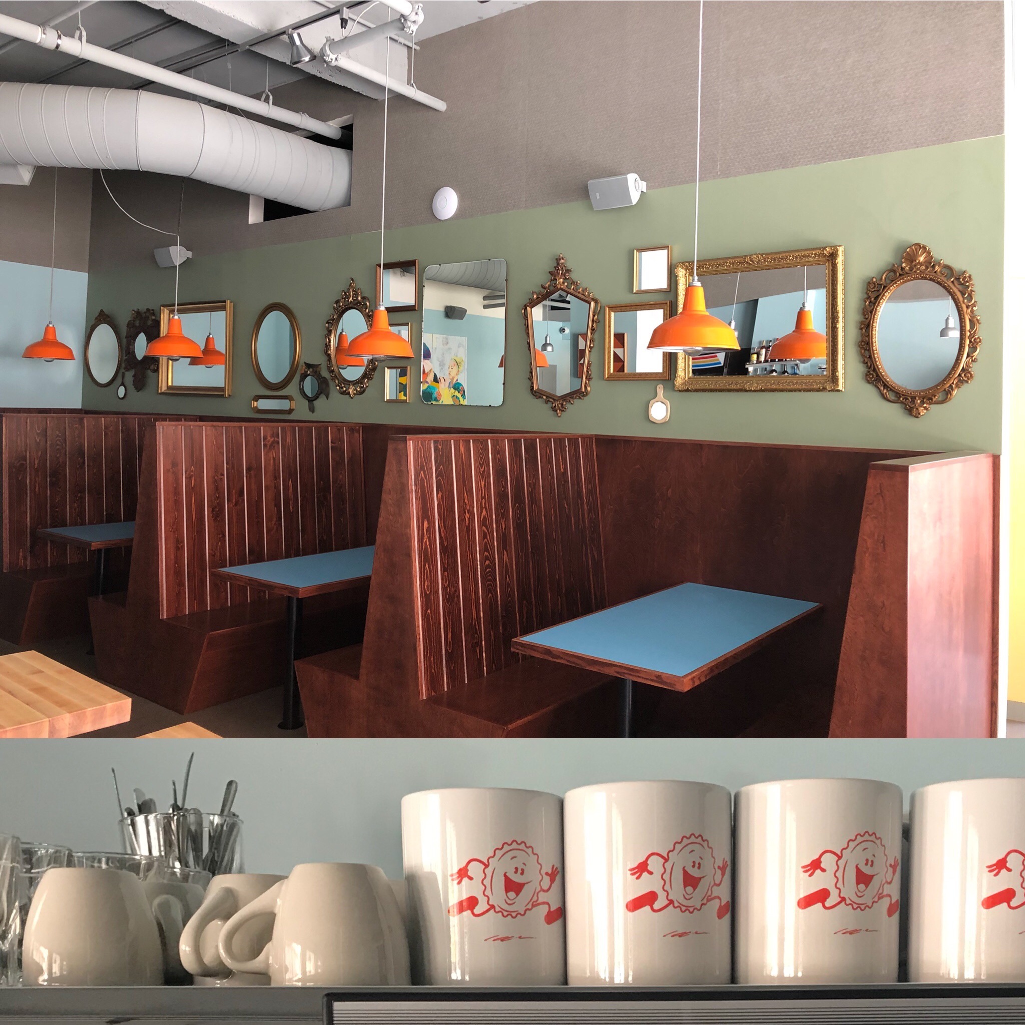
PIE FOR BREAKFAST IS A DAMN GOOD DINER
“In 2014, Trevett Hooper decided he wanted to open a restaurant serving well-sourced, thoughtfully prepared food at an affordable price. The vision was for something akin to a neighborhood diner or all-day cafe, but better. Hooper and his wife Sarah already owned two beloved Pittsburgh establishments on Craig St in Oakland — Legume, a high-end bistro, and, adjoining it, a great bar with great food called Butterjoint. When the corner space on their block opened up it made sense to take the leap. It took quite a bit longer than expected, but in June 2018, the Hoopers opened Pie for Breakfast.”
- Pittsburgh Magazine, Oct. 2018
I have been working with Trevett since 2012 when he opened Butterjoint and I was brought on to help design the logo. Slow forward through years of designing all manner of postcards and social media graphics for Legume and Butterjoint, screenprinting wine menus for Legume, illustrating pierogis and veggies, and drinking and eating the finest food. At the end of 2015, Trevett said he was ready to open his third spot on the block and asked if I would design the logo. Of course I would. Then he asked if I would “help pick some colors for the space.” Of course I would. And suddenly I found myself attending meetings with the architect and the contractor and spec’ing sound dampening materials and light fixtures.
This project is one of my all-time favorites for two reasons: I love this crew of people and I loved all the moving pieces of helping to design and bring a restaurant into being. When I sit in a space that I designed while enjoying my pie and coffee, I am totally content and excited at the same time. Pie for Breakfast feels happy, lively, and lovely, all in one.
Scroll down through the images to watch Pie for Breakfast come to life.
THE BEGINNING
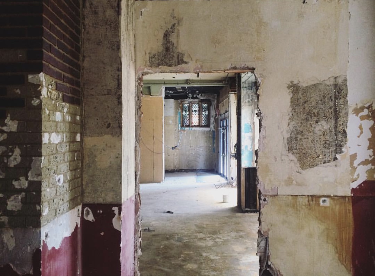
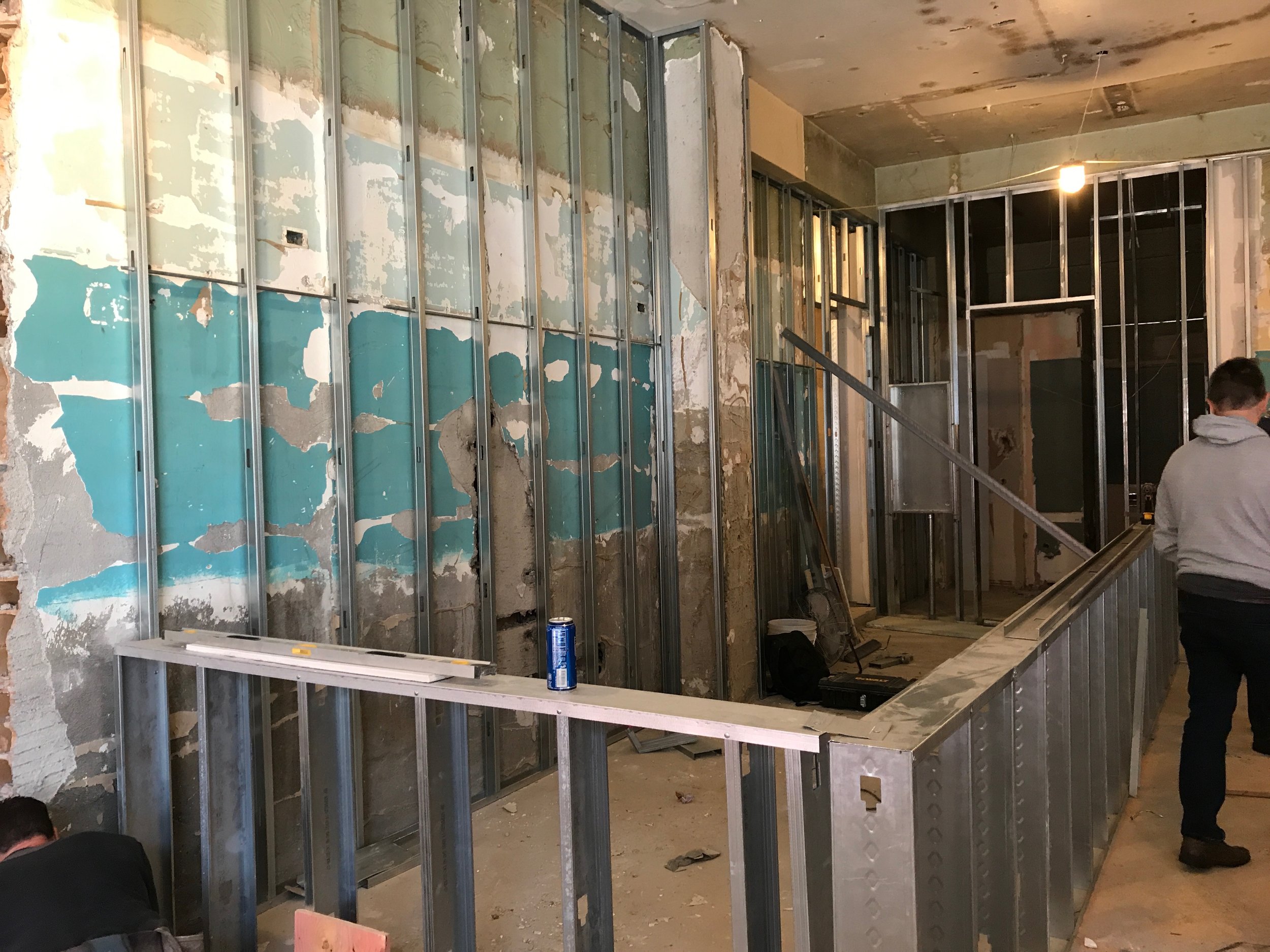
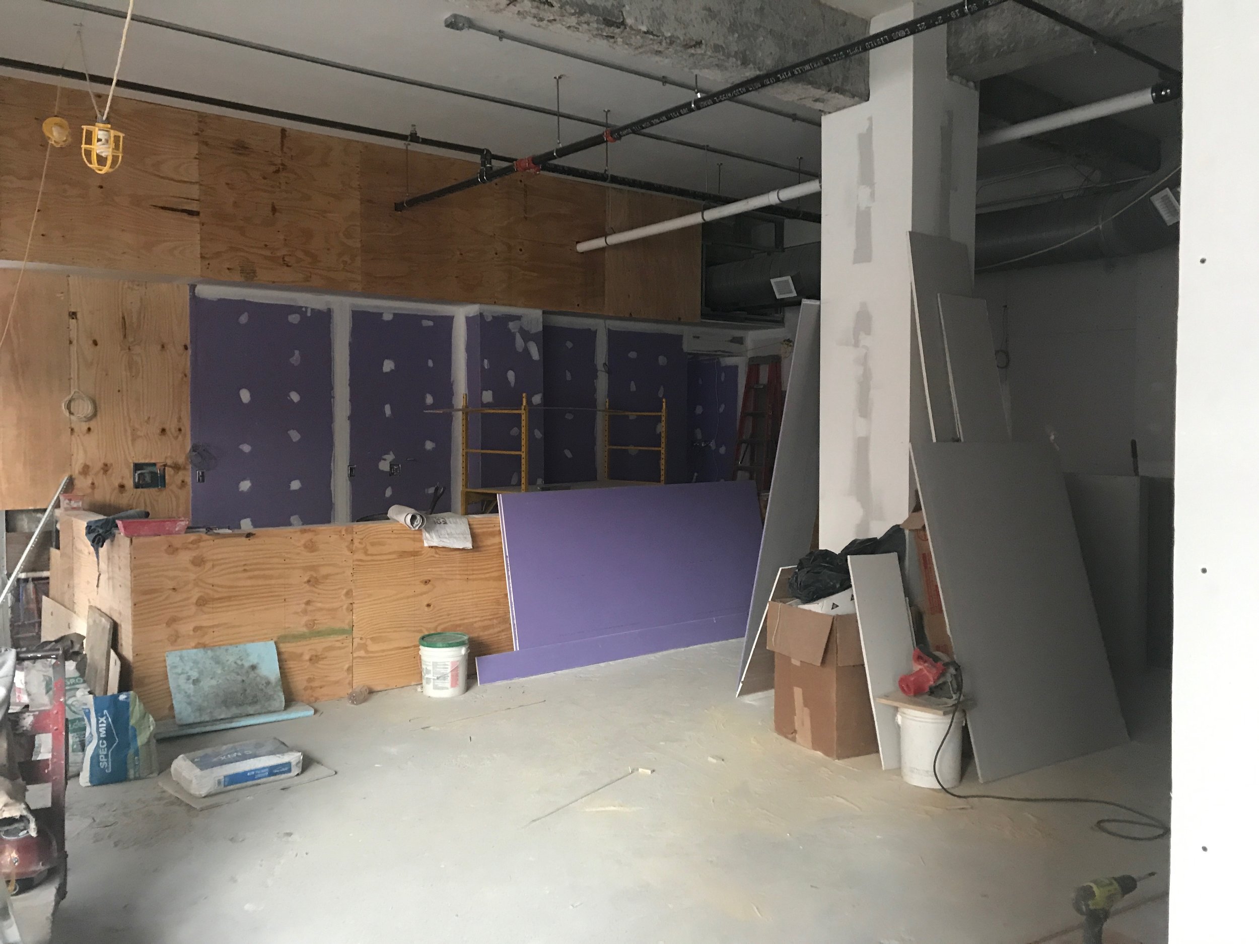
Such a gorgeous raw space.
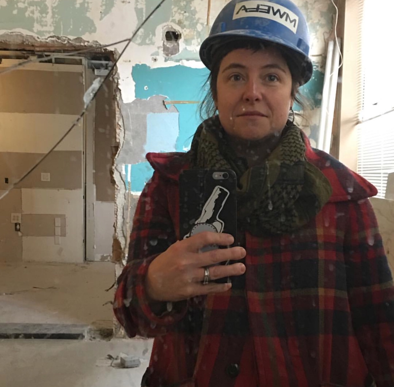
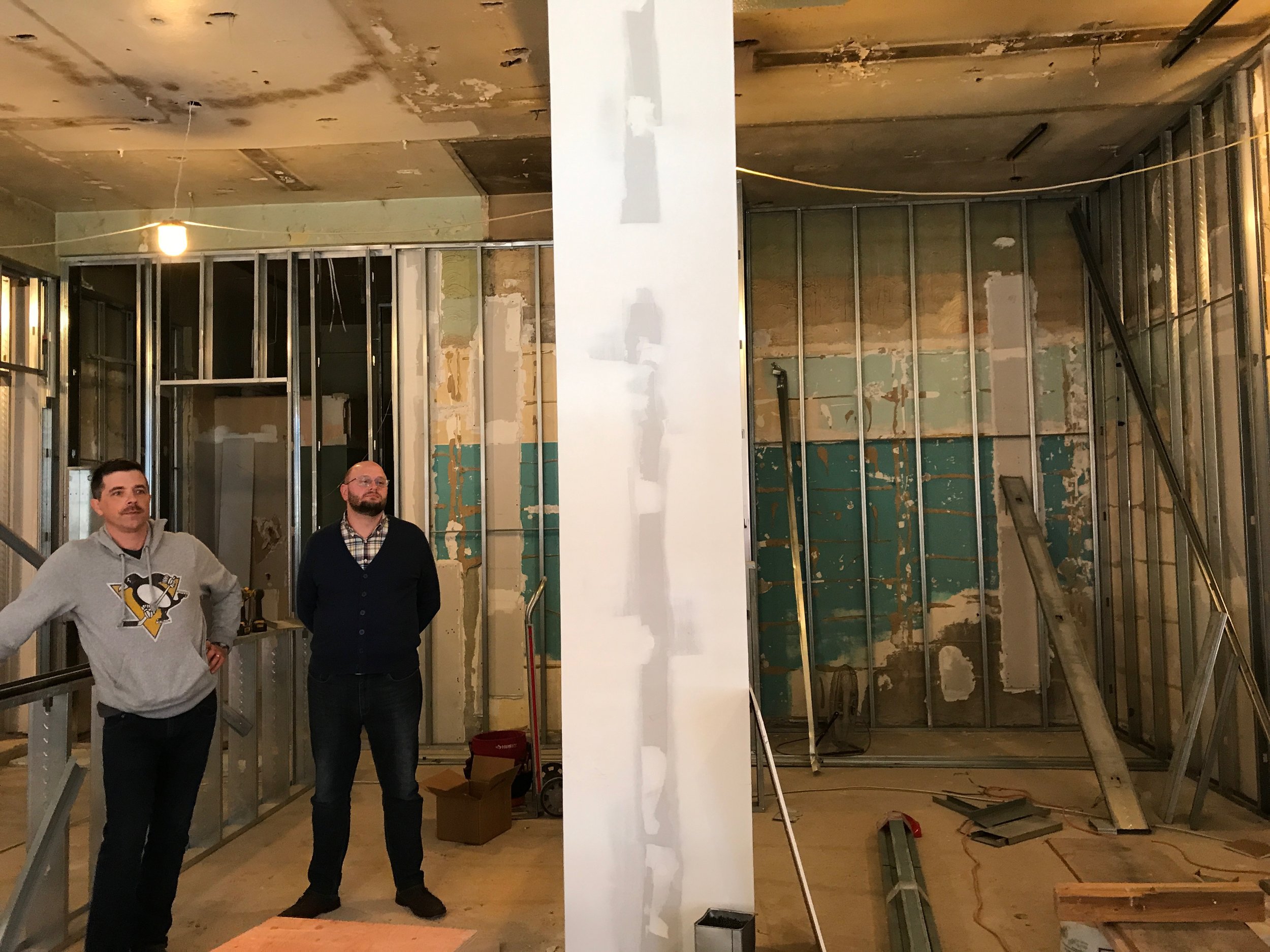
Initial walk through.
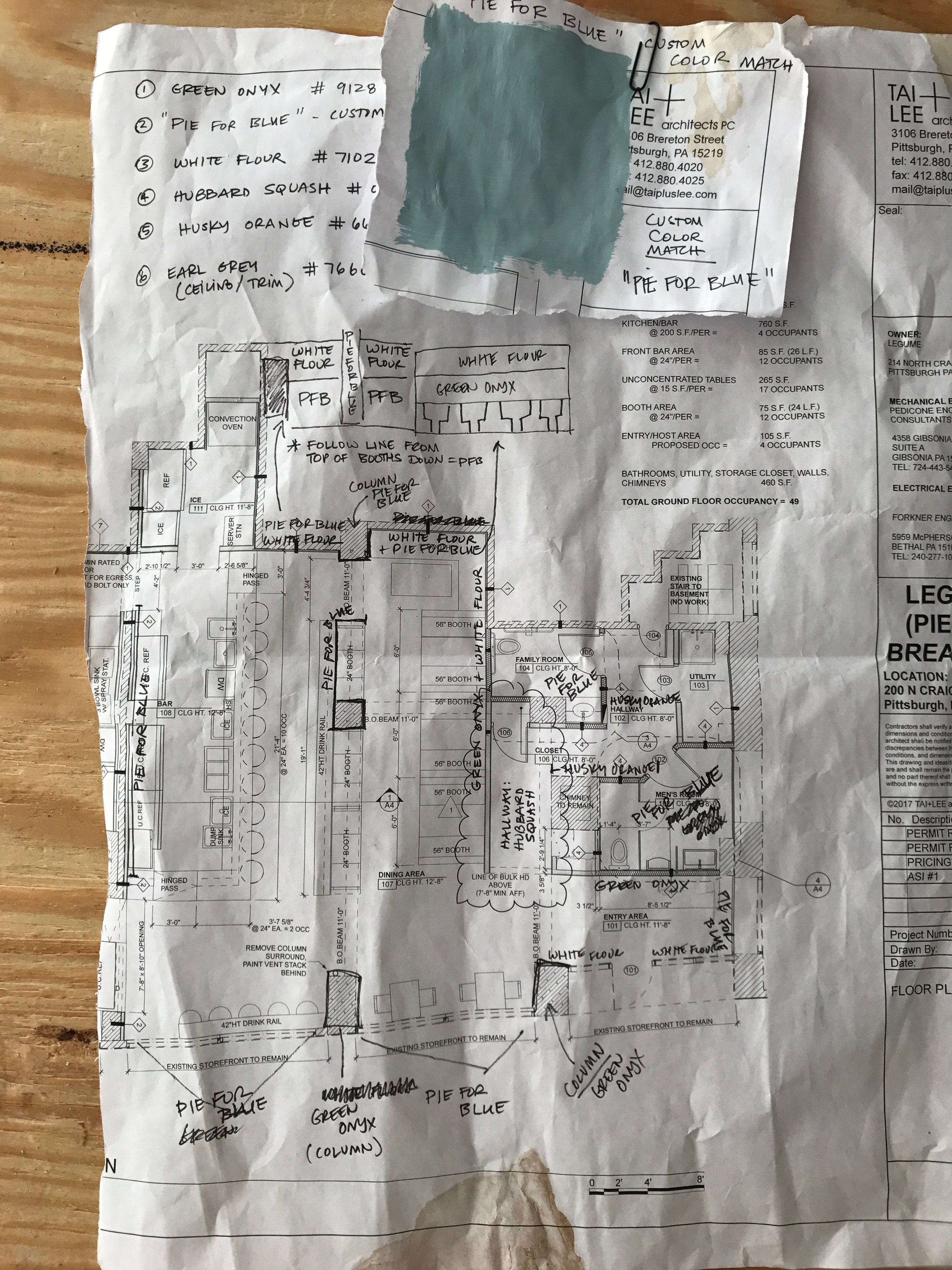
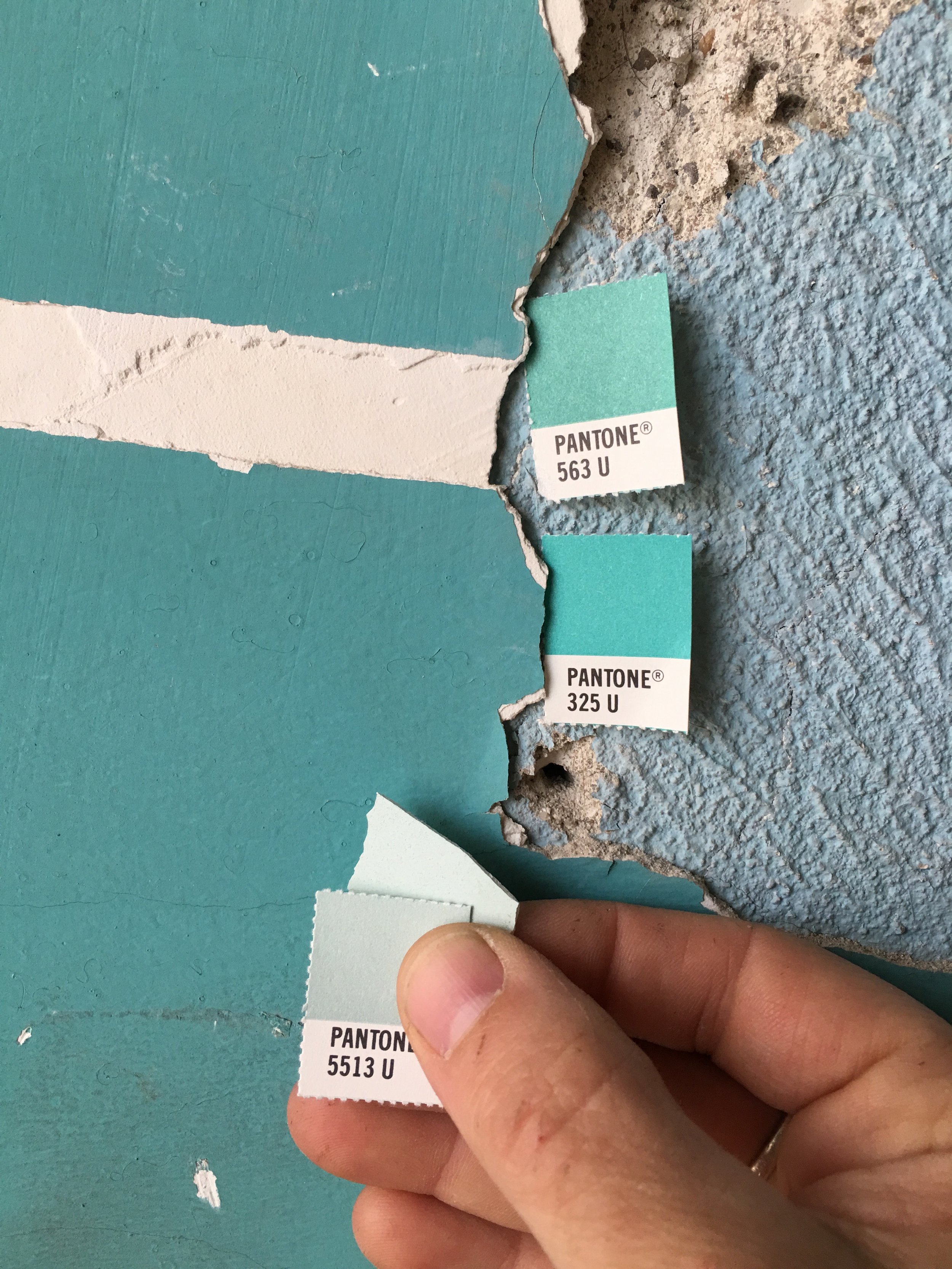
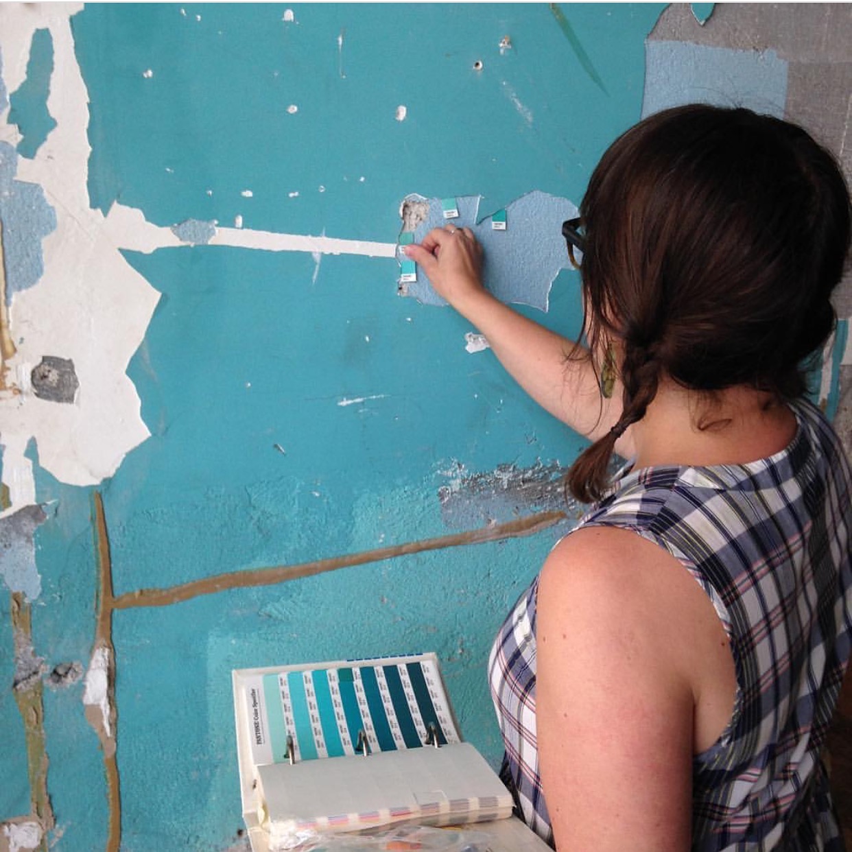
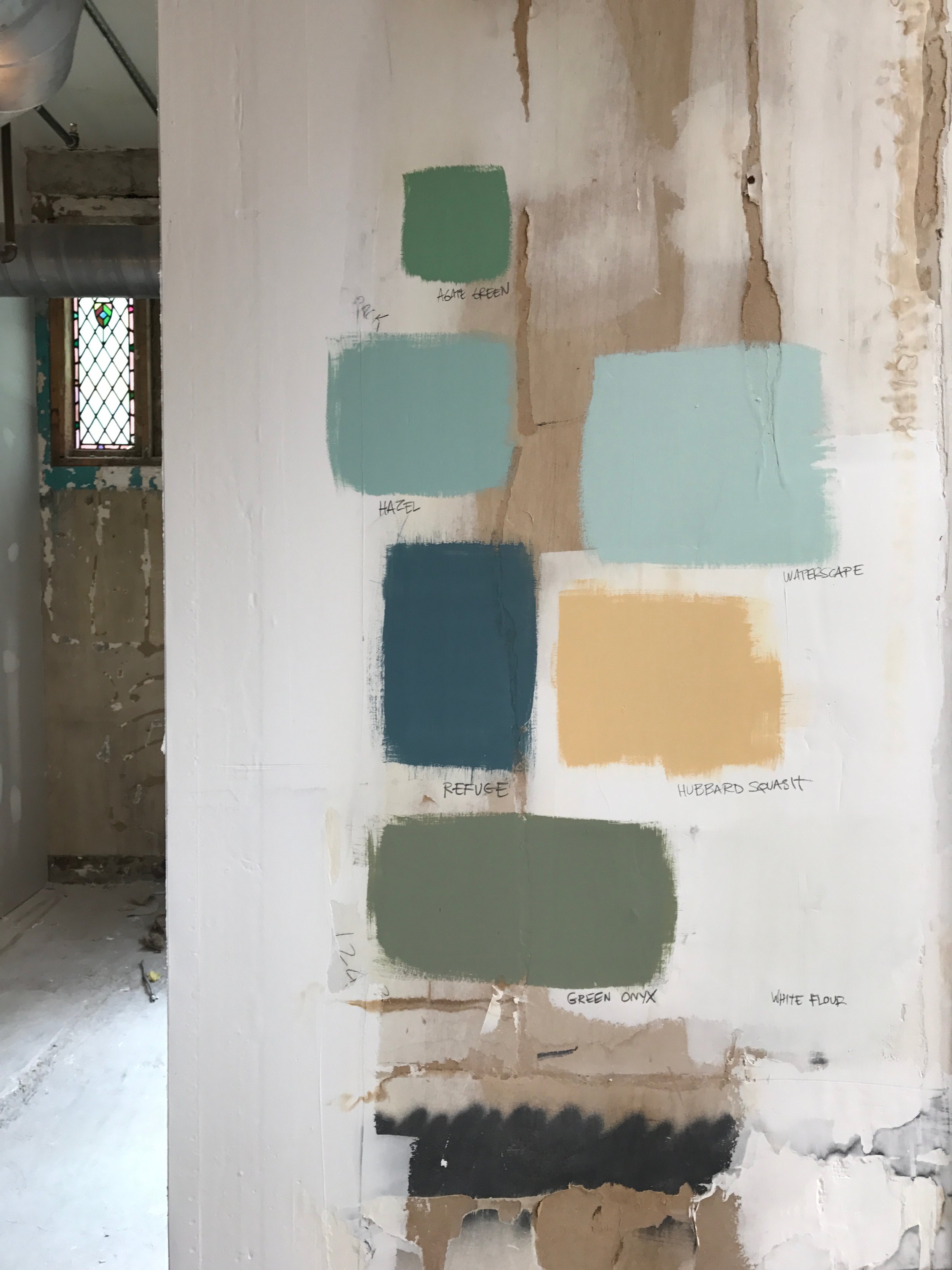
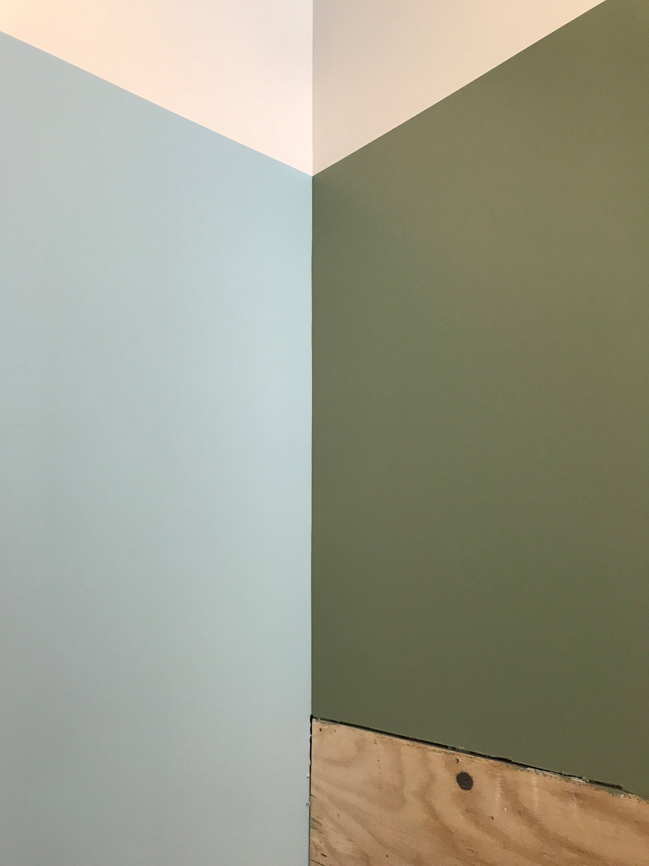
This is the first time I saw the space and I loved the walls right away. These colors were my inspiration for the entire project.
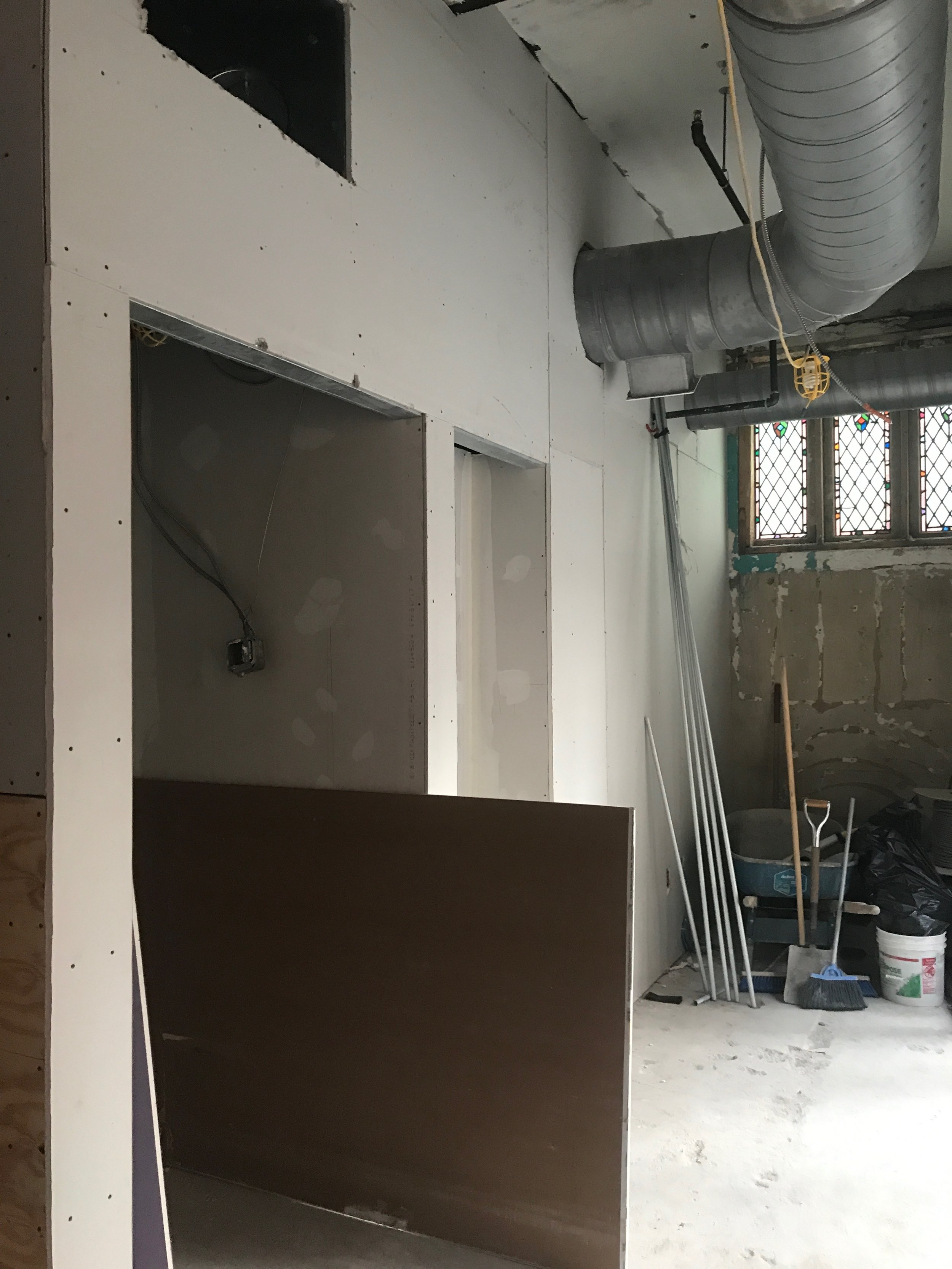
I love learning how a space works - what walls are load-bearing, where the ducts run, etc.
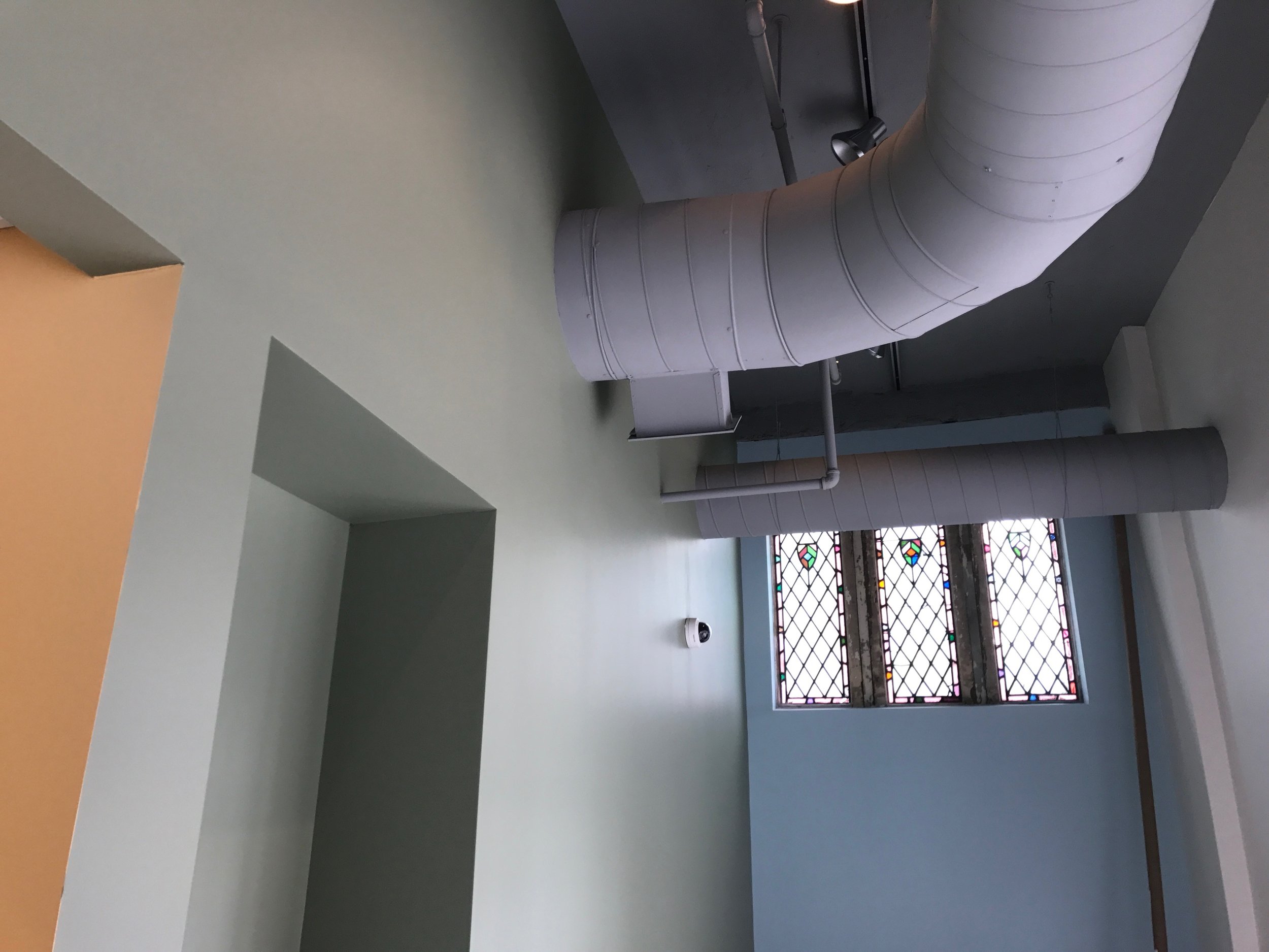
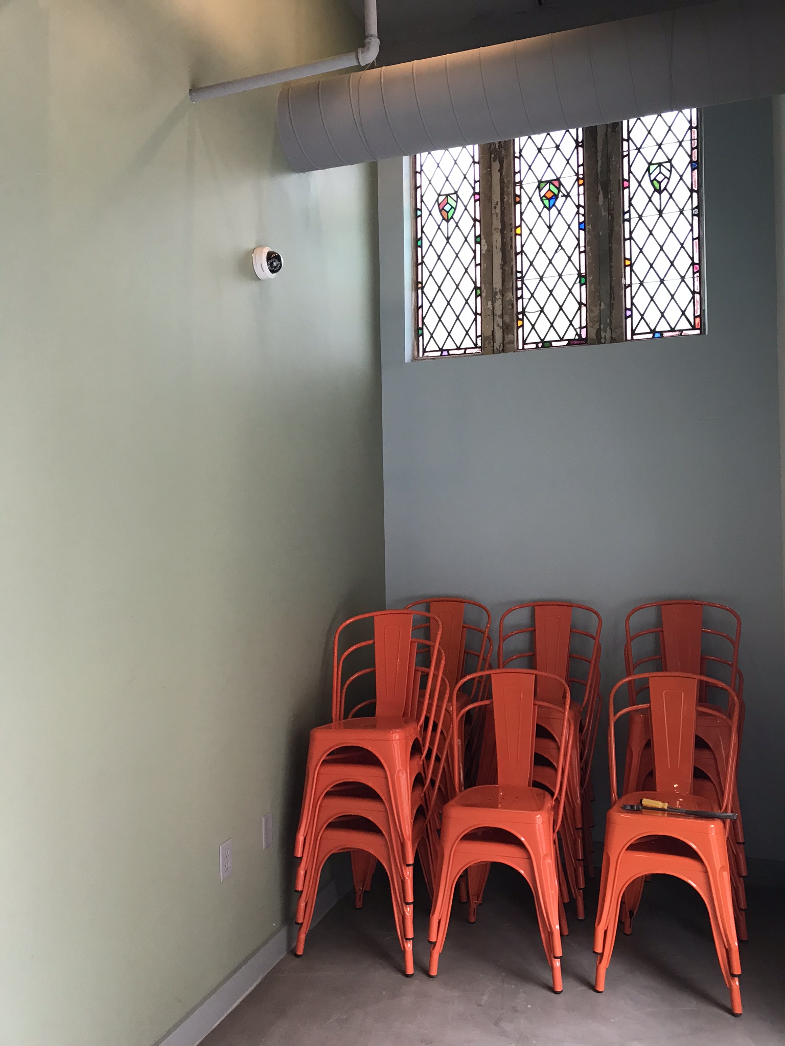
During demo they uncovered these perfect leaded glass windows.
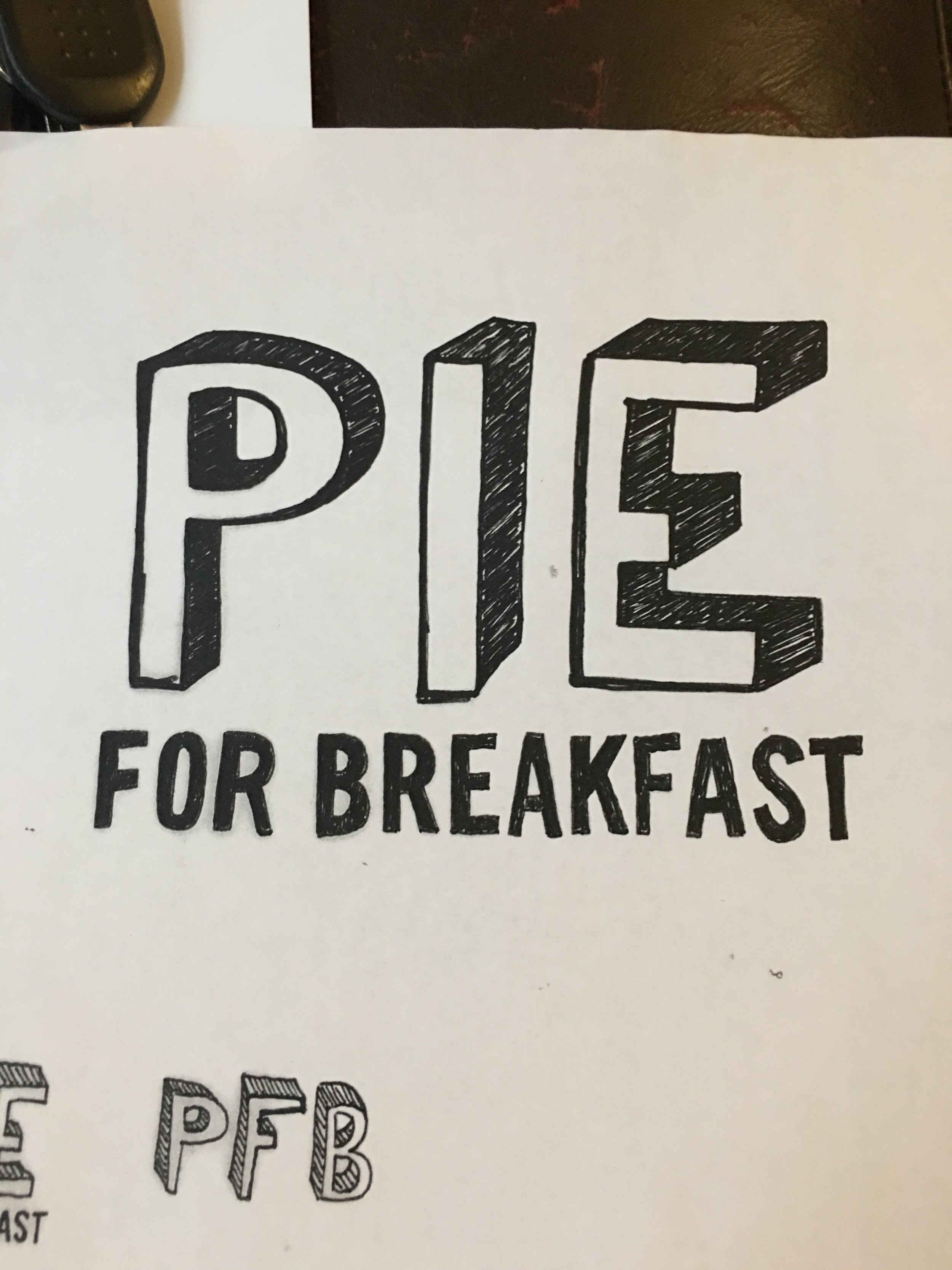
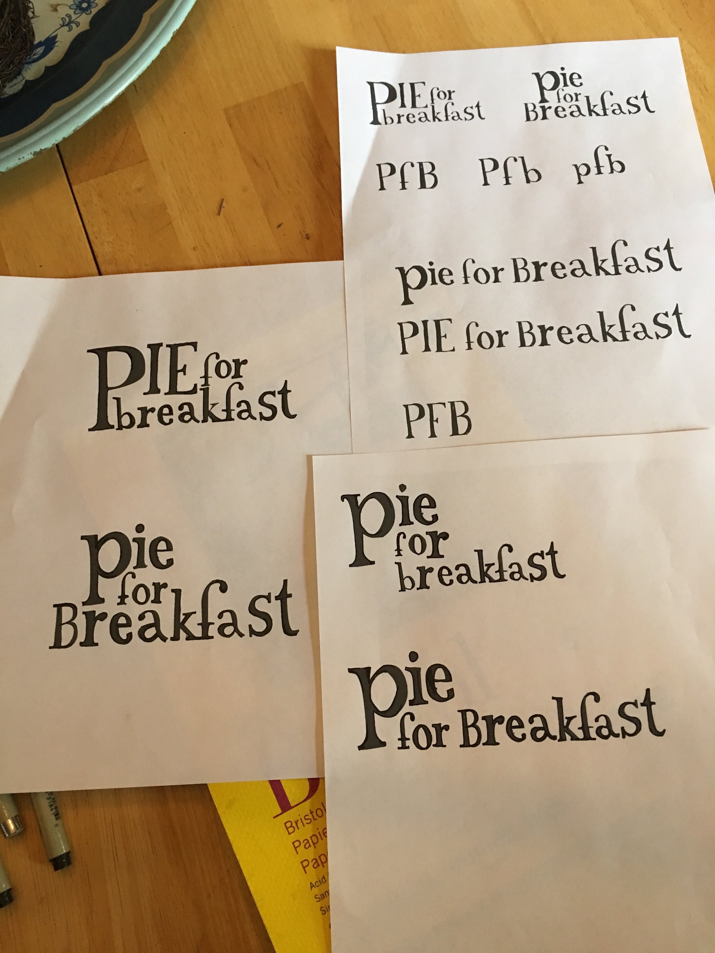
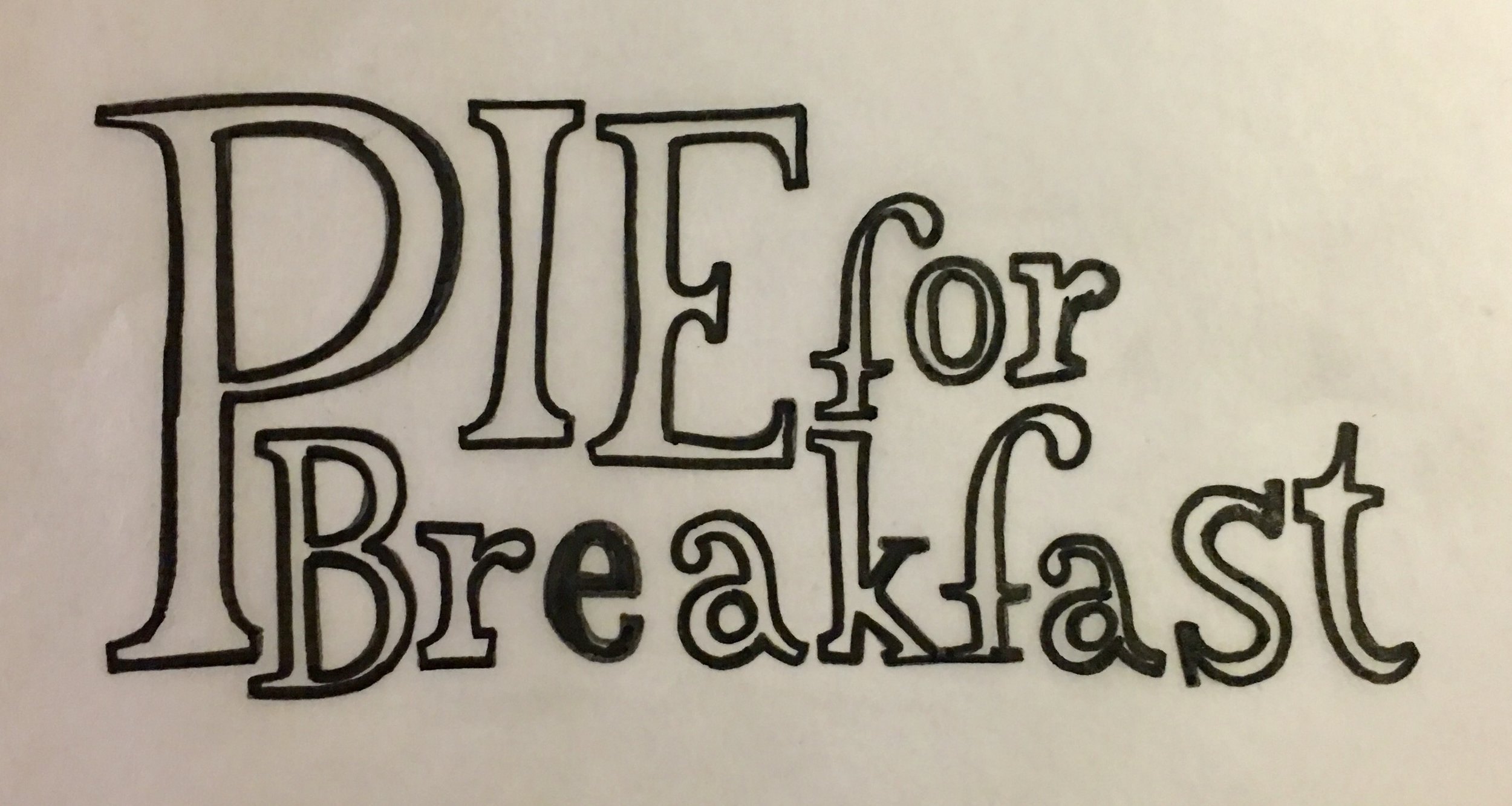
I have pages and pages that I could show of the logo design process. It was a collaboration with lots of discussion and sketching and reworking that got us to the final. Trevett wanted hand-drawn and fun.
It seems funny to call them refinements when we wanted something fun and loose and handmade. But refinements were made.
Drawing and re-drawing.
Cutting and pasting.
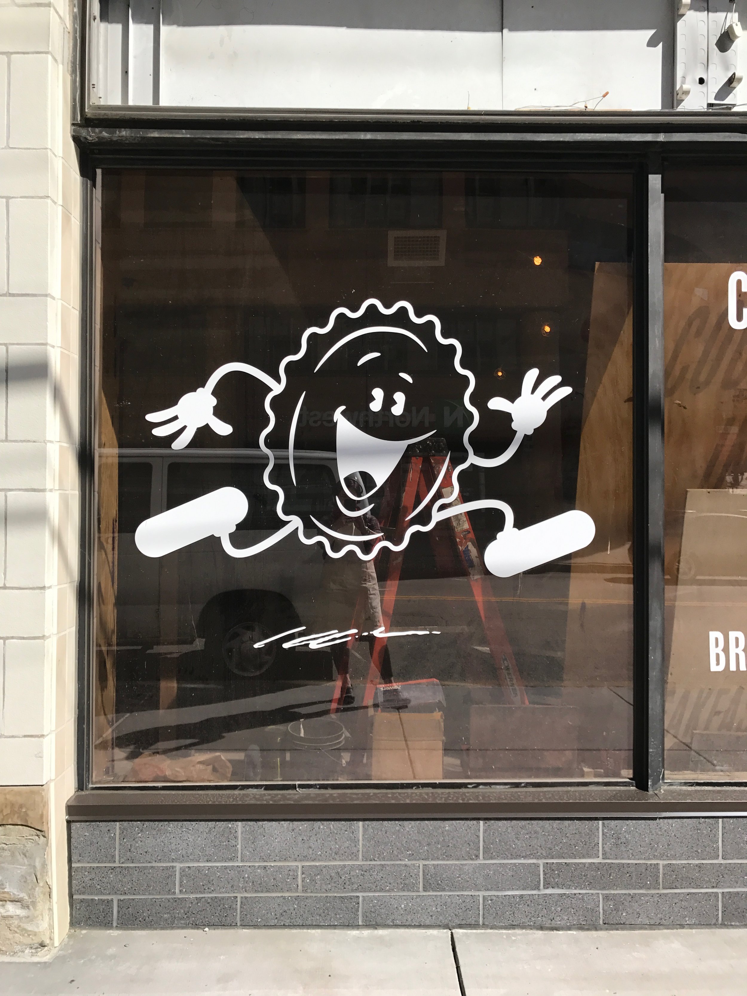
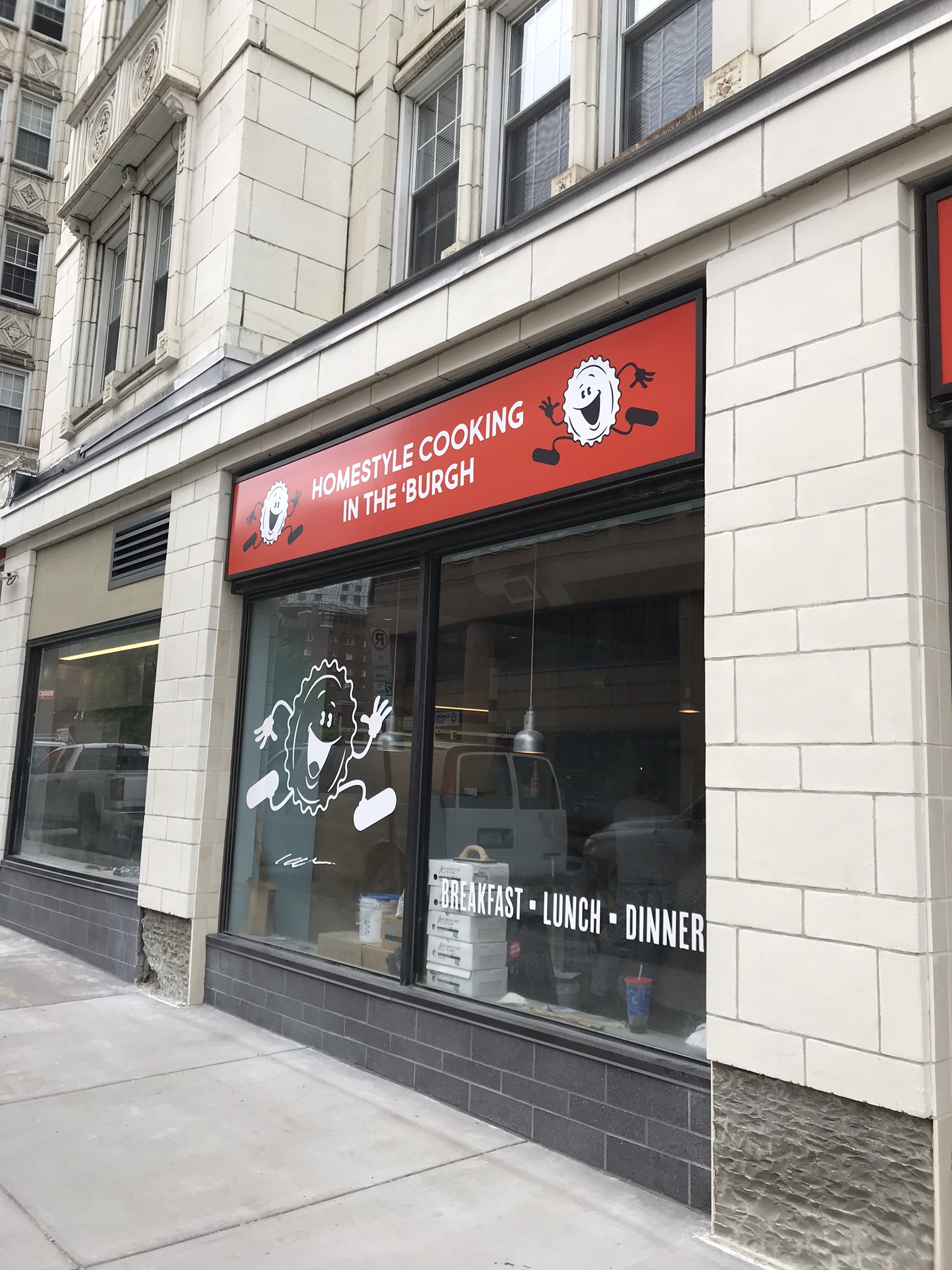
And there it is, larger than life on the front window.
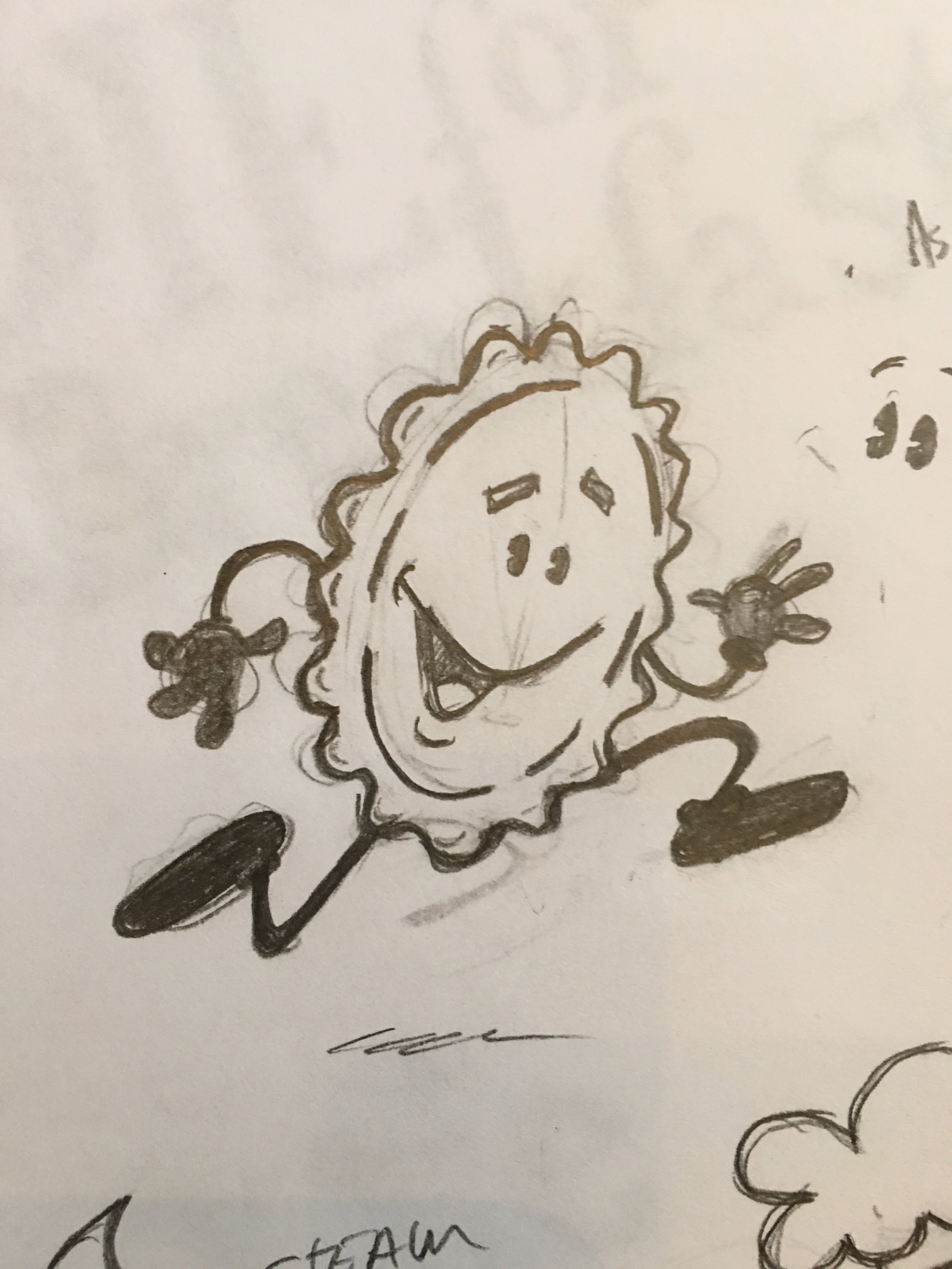
Trevett has been itching for a mascot for one of his restaurants for as long as I’ve worked with him. Dan Rugh, of CommonWealth Press, brought Pierce to life in the best way.
Planting the Pierce flag on Craig Street.
Once you have a charming mascot you need lots of cool stuff with him on it. We’ve made tea towels, mugs, stickers, pins, and tees…so far.
After I delivered the final logo and mascot Trevett asked me simply, “Would you be able to help pick colors for this new restaurant?” I, of course, said yes and then the project bloomed into something entirely different. But it all started with the colors.
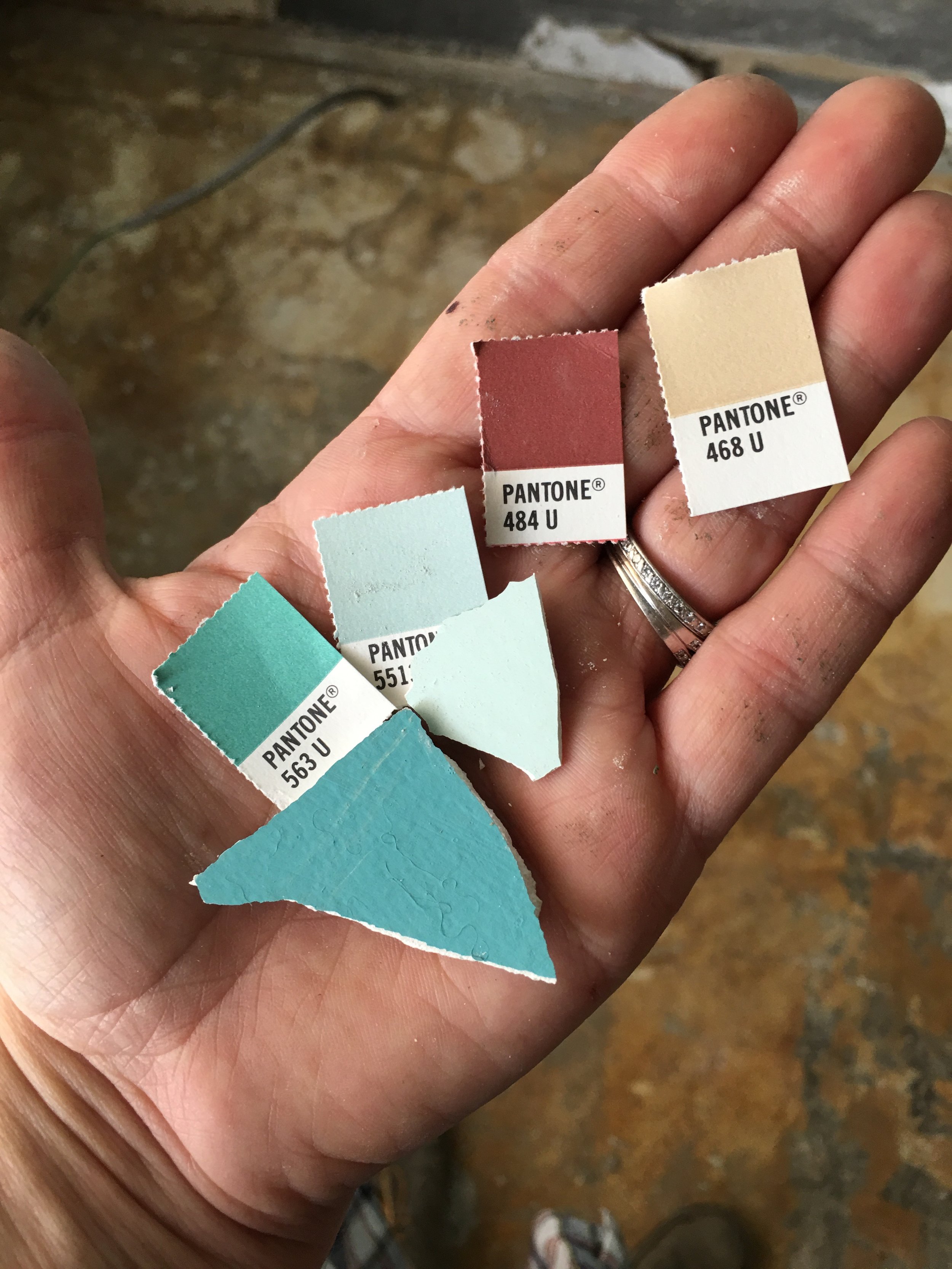
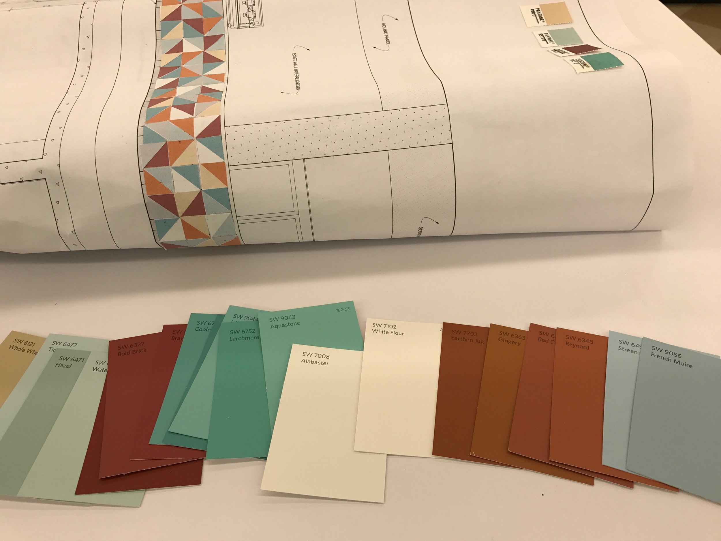
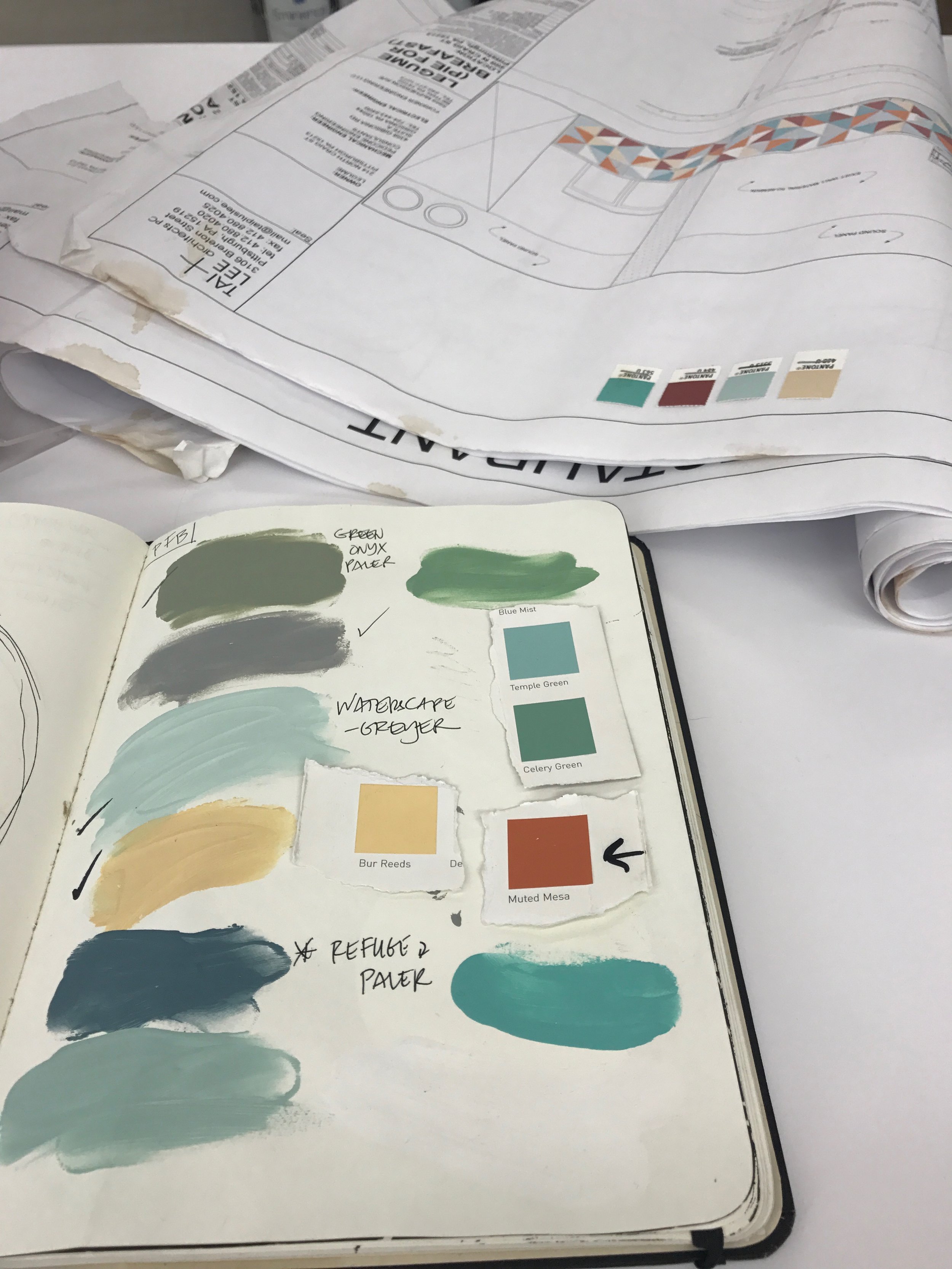
With my crazy-old Pantone book.
Pulling together a palette slowly.
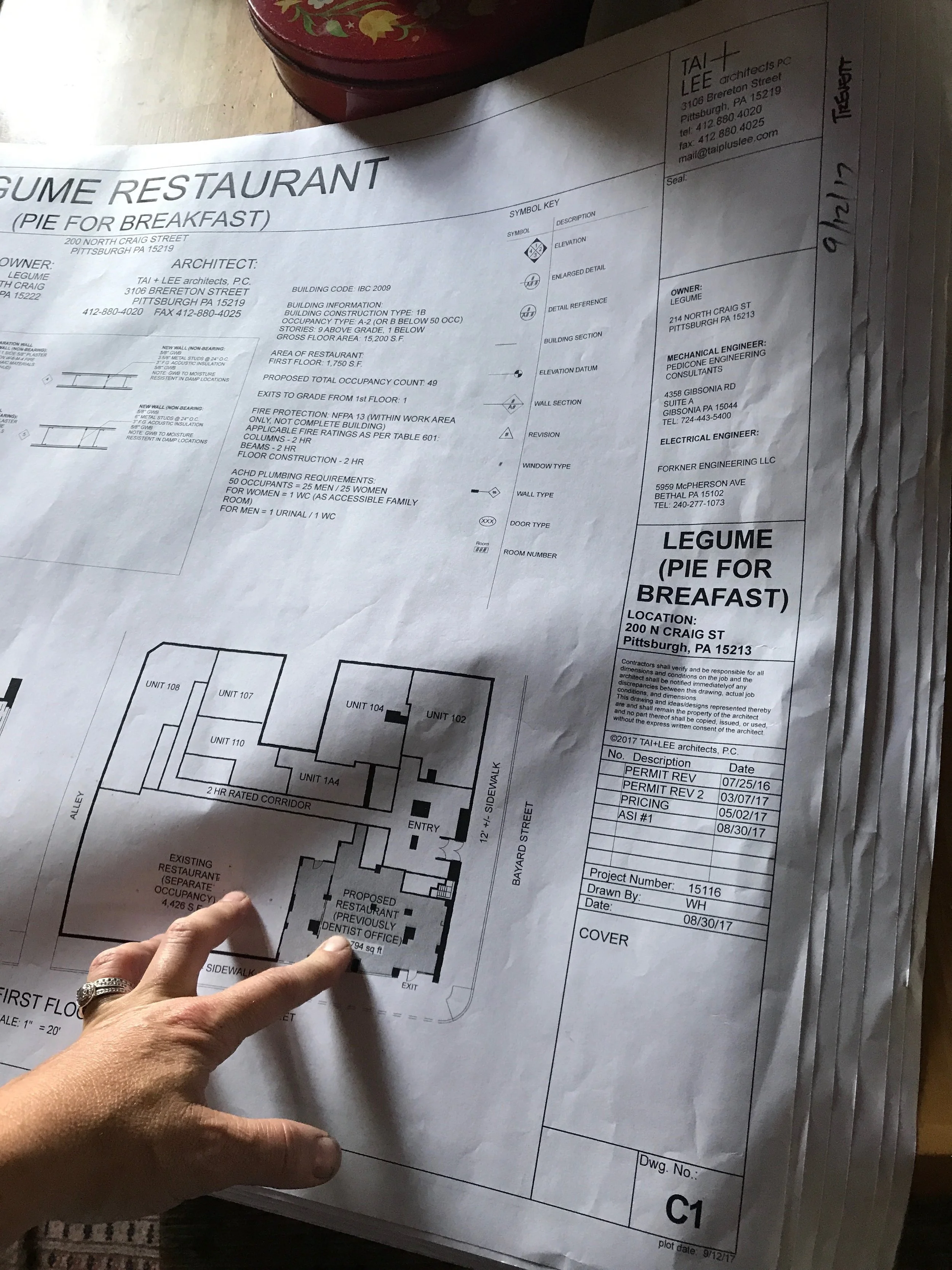
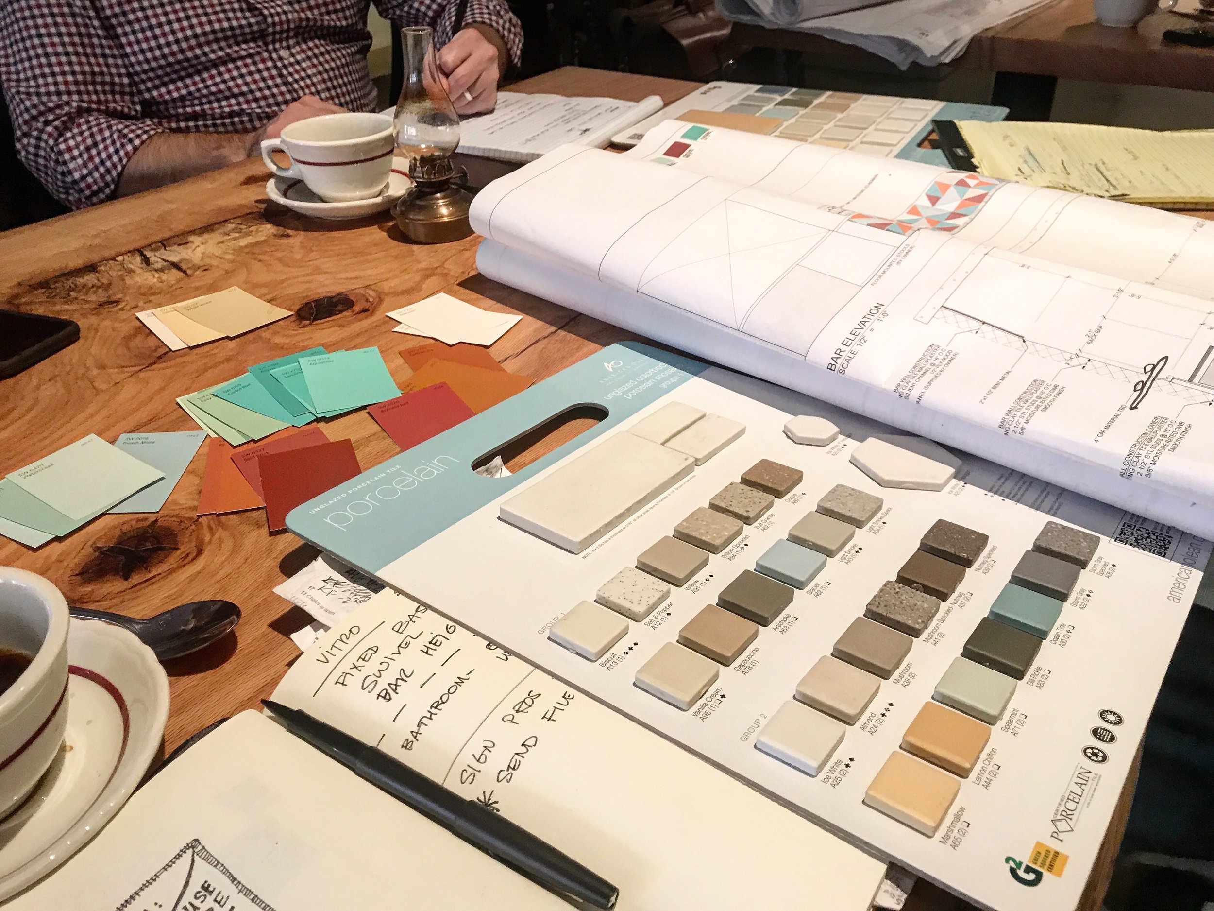
Blueprints - and how I learned to read them… (sort of)
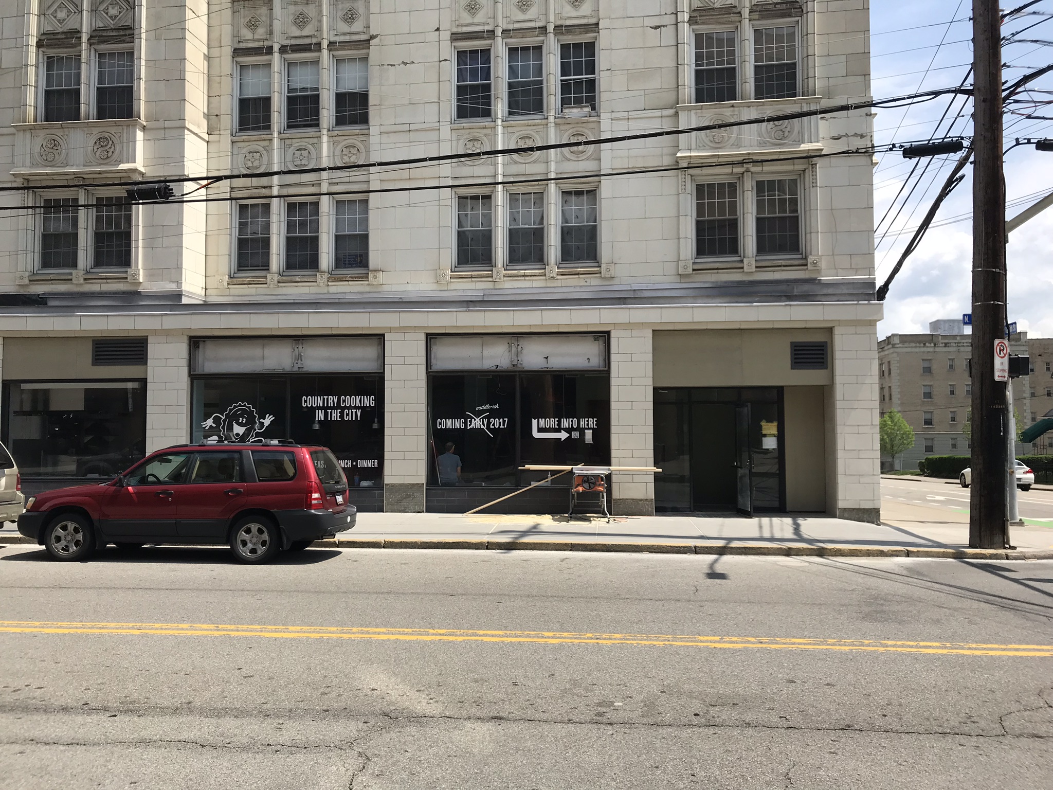
Starting to claim the corner with vinyl signs in the windows. We opted not to cover the windows with paper during construction so the neighbors could watch their future neighborhood diner taking shape.
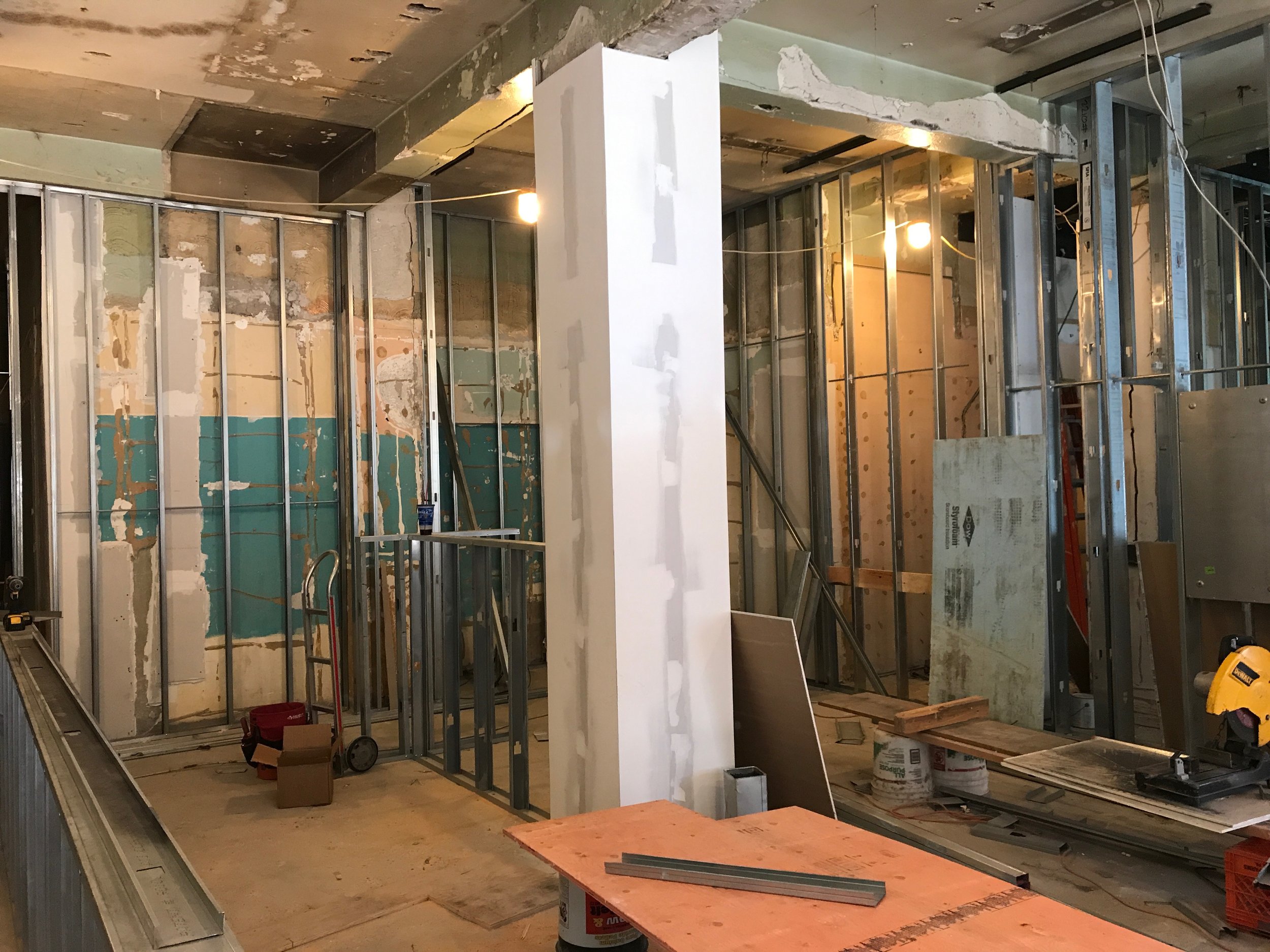
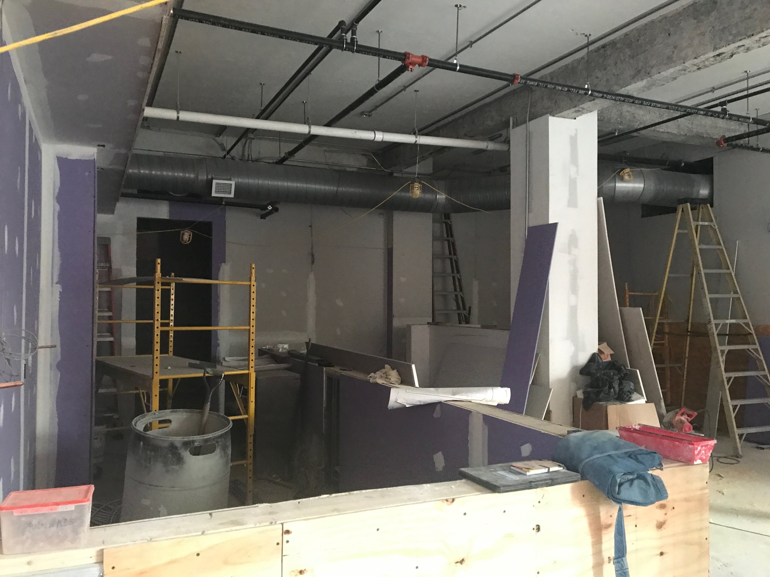
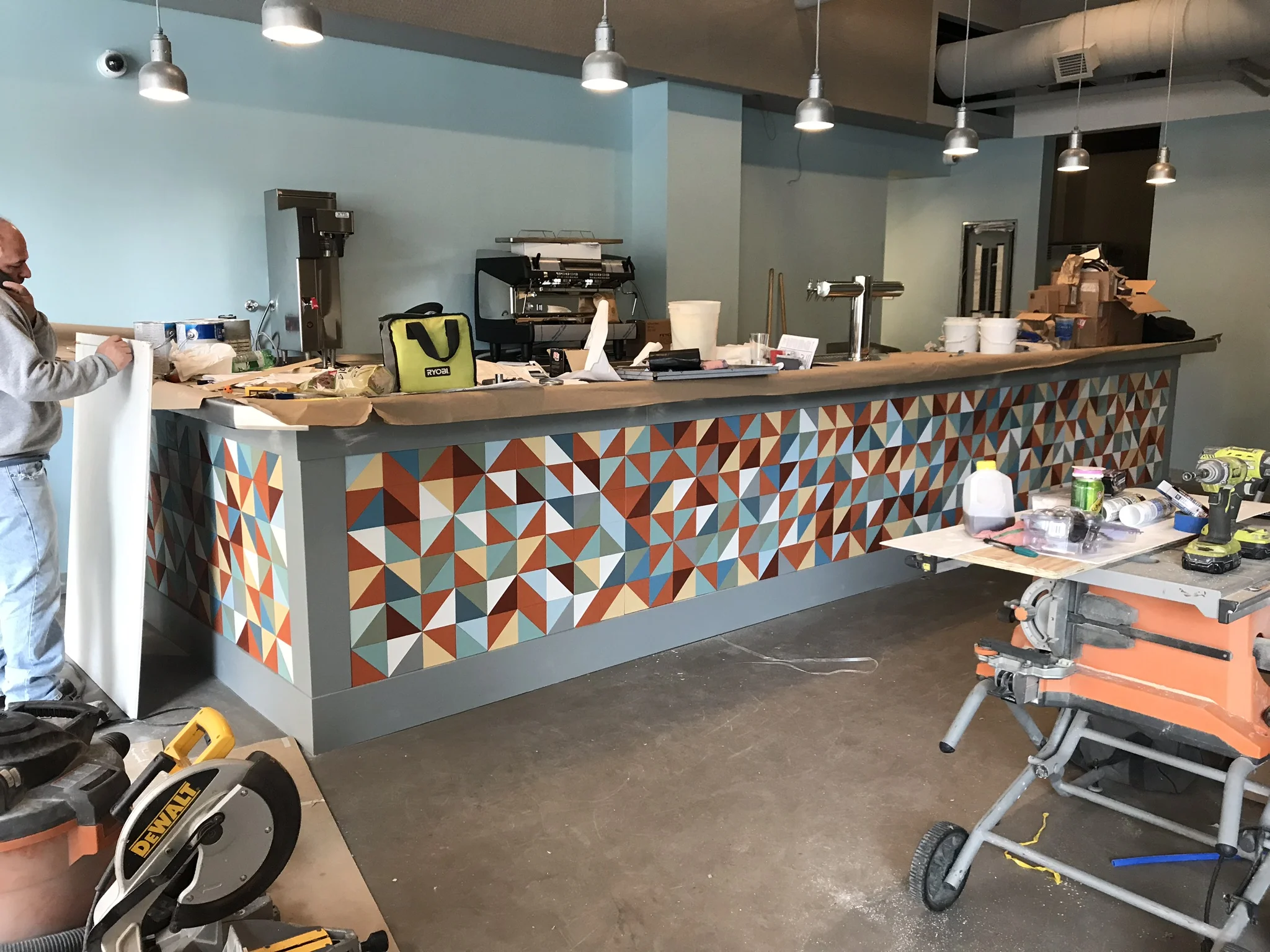
Framing in bar.
Mostly just please note the mustache on Trevett.
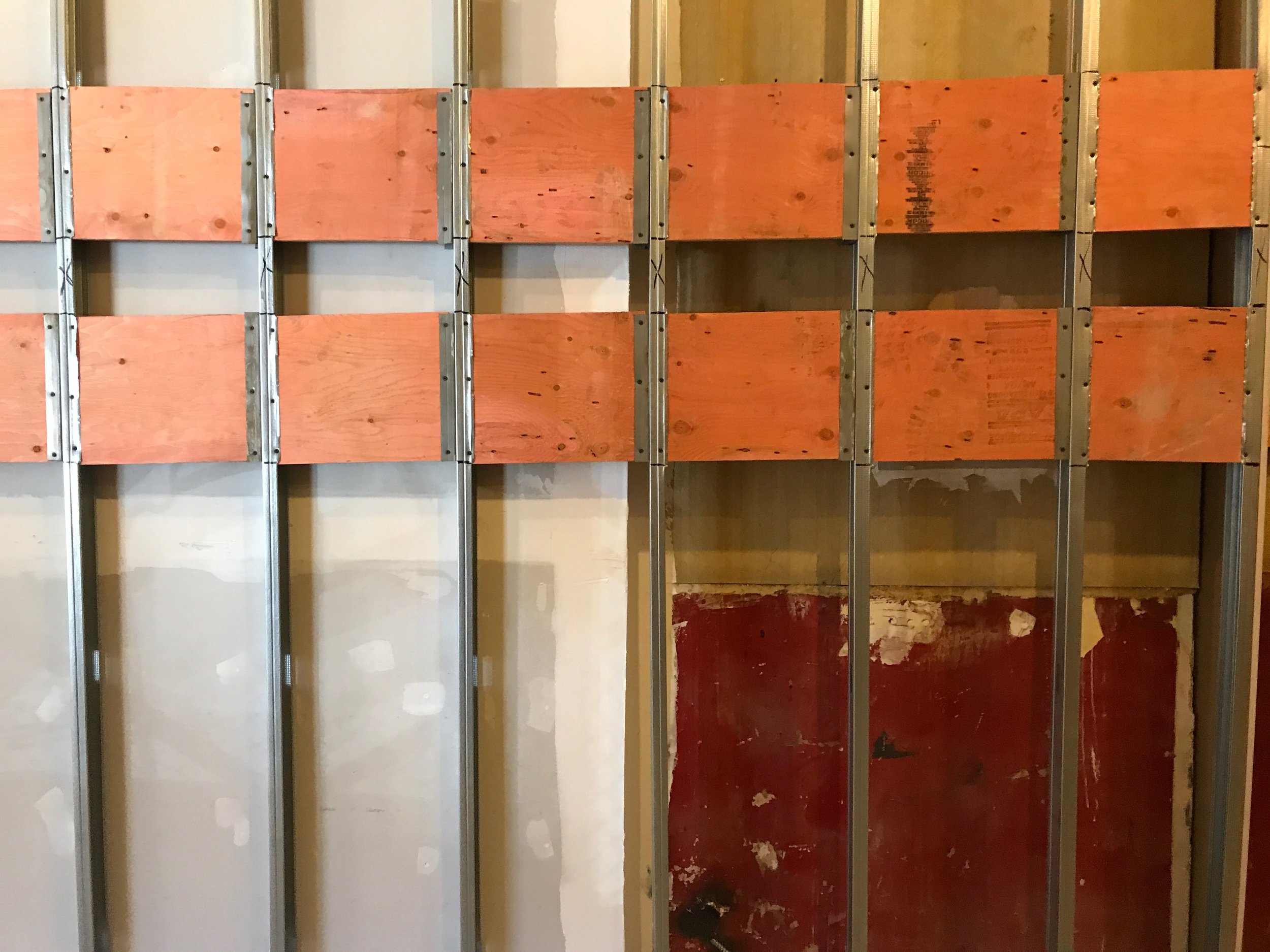
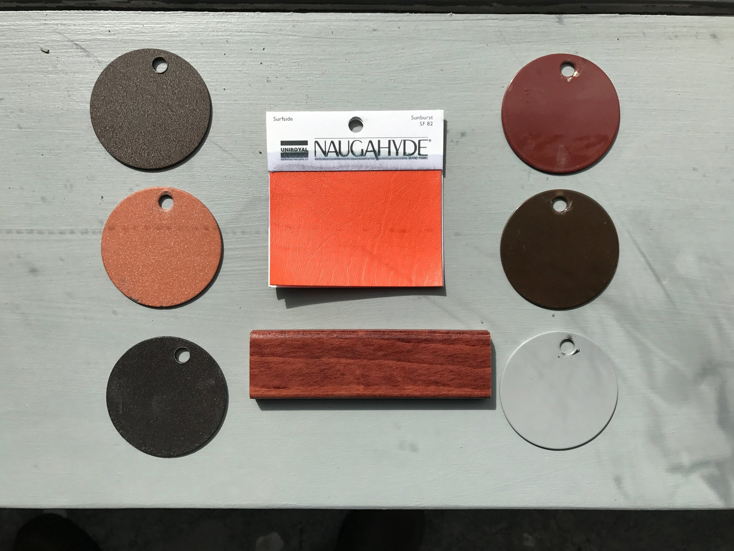
If memory serves these orange panels are this color because they’re treated with a flame retardant and I loved the color so much I kept a sample to work with later on.
I had mixed feelings about seeing the lovely old walls being covered up but watching a space take form is pretty cool, too.
MY FIRST PITCH:
As I mentioned I was brought on to choose colors for the restaurant. But when we first walked through and started talking about ideas it became apparent that there was so much more I could do, and wanted to do, and Trevett was down for that, thankfully.
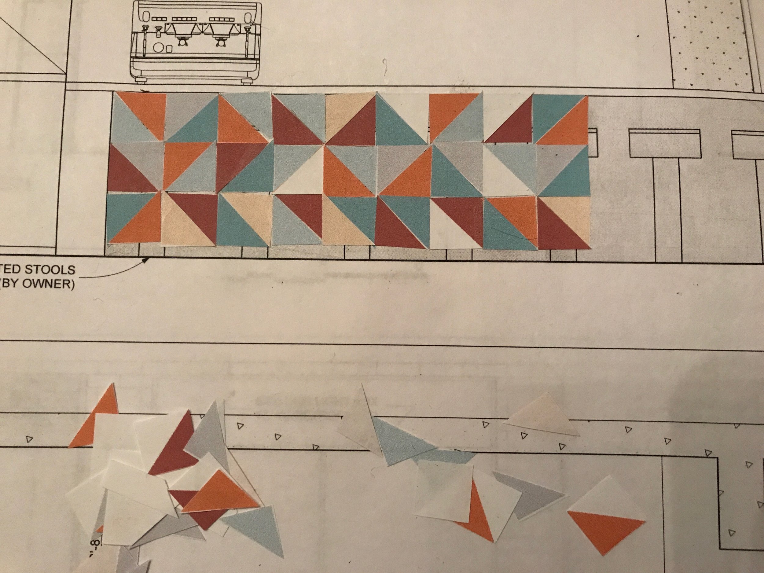
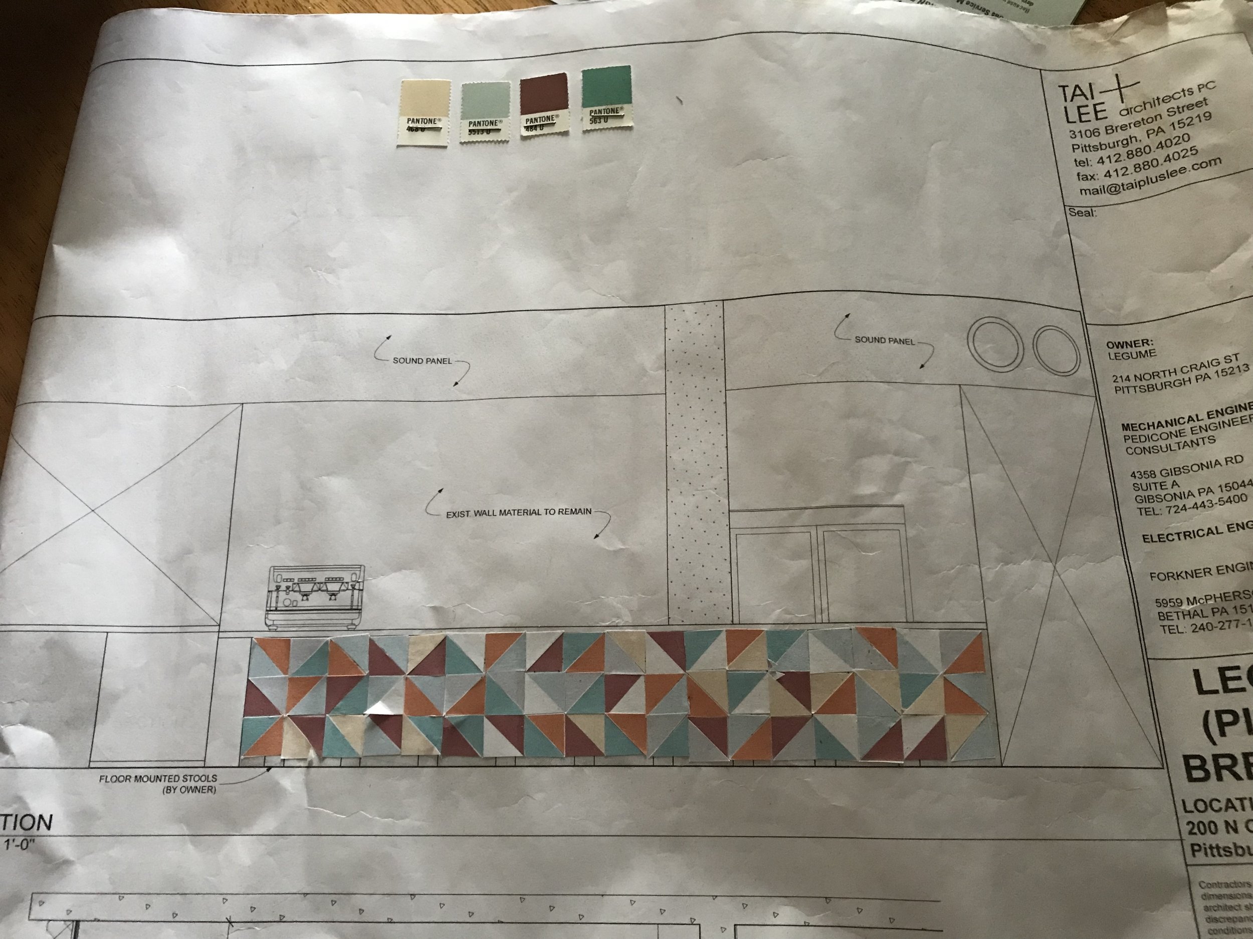
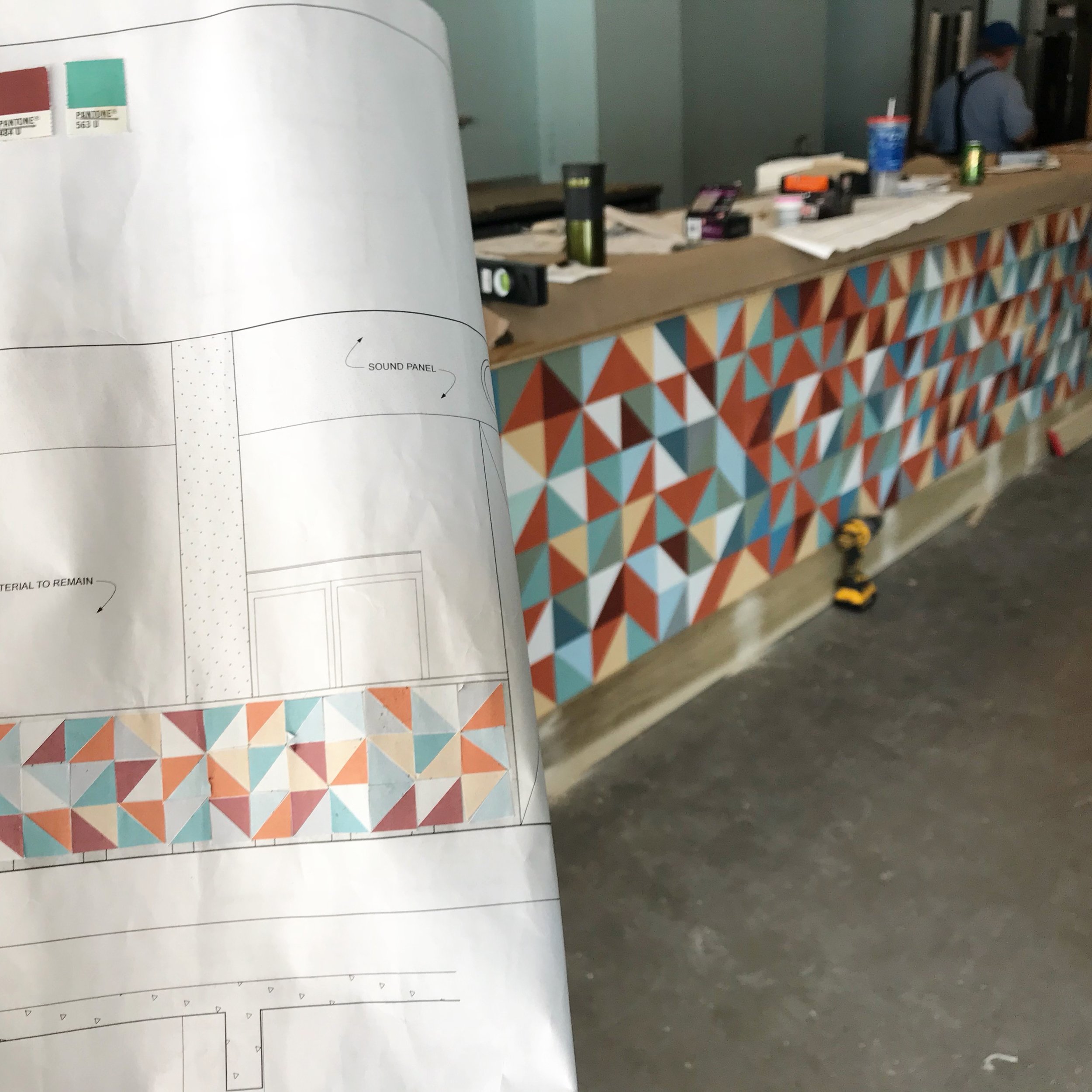
A few weeks later I made my first pitch to Trevett and his team. This is the main piece I brought to the meeting and it became the jumping off point for design and eventually the focal point of the entire restaurant. I’m still old school when it comes to presenting ideas so I cut and pasted a collage of tiny paper triangles right onto the blueprints. So pro.
I love the idea of “pie for breakfast” and the feeling it connotes. It was a natural fit for me to want to incorporate some sort of quilted element in the space. My initial idea was to create this from all the various materials that would be used in the space throughout the project - I thought it would be simple to get the crew excited about setting aside bits and scraps for me in addition to doing their main jobs…
I spent so much time at the Sherwin Williams store on Centre Ave. I have an account and even bought myself one of those legit paint sample books.
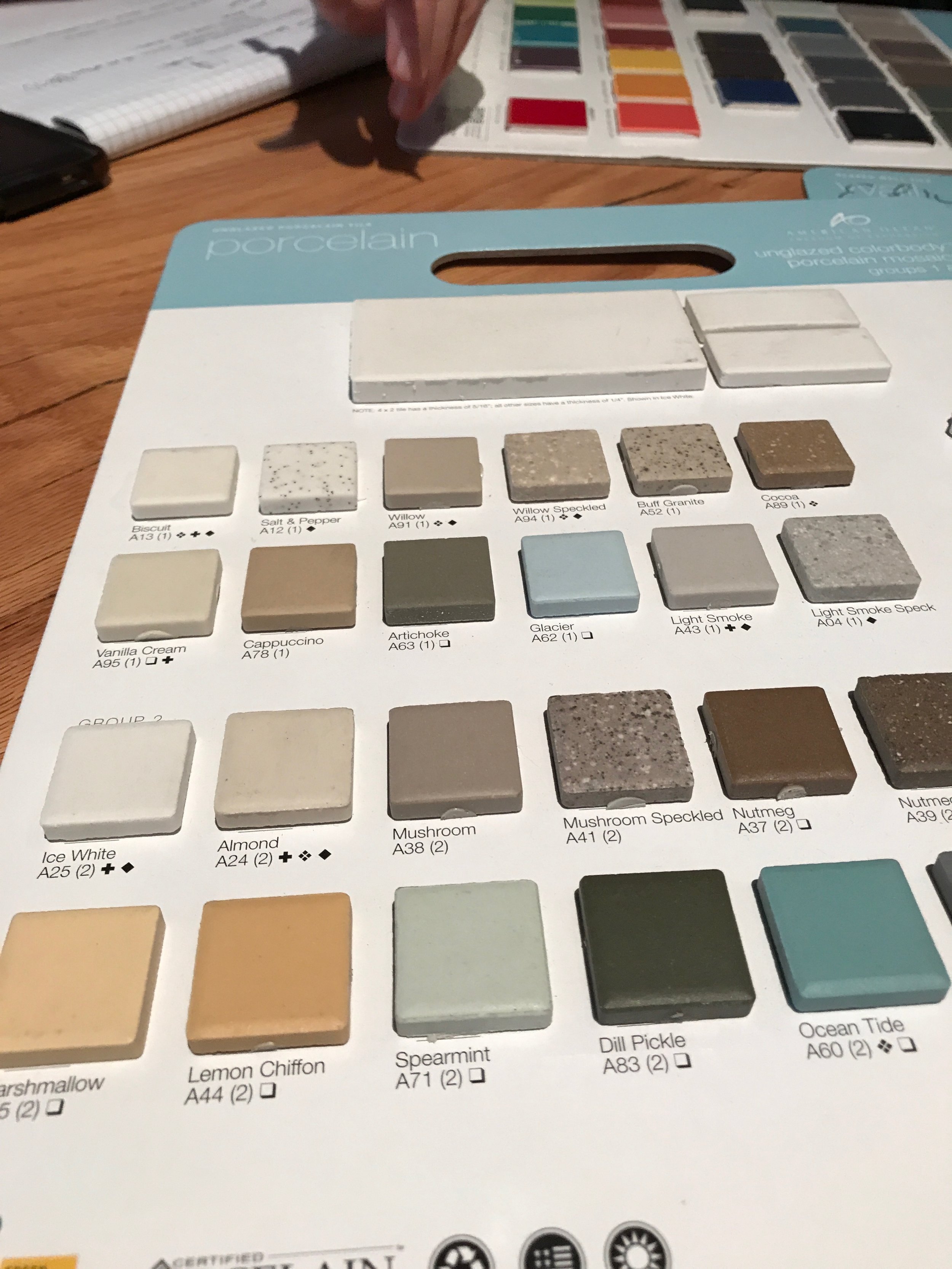
Tile samples.
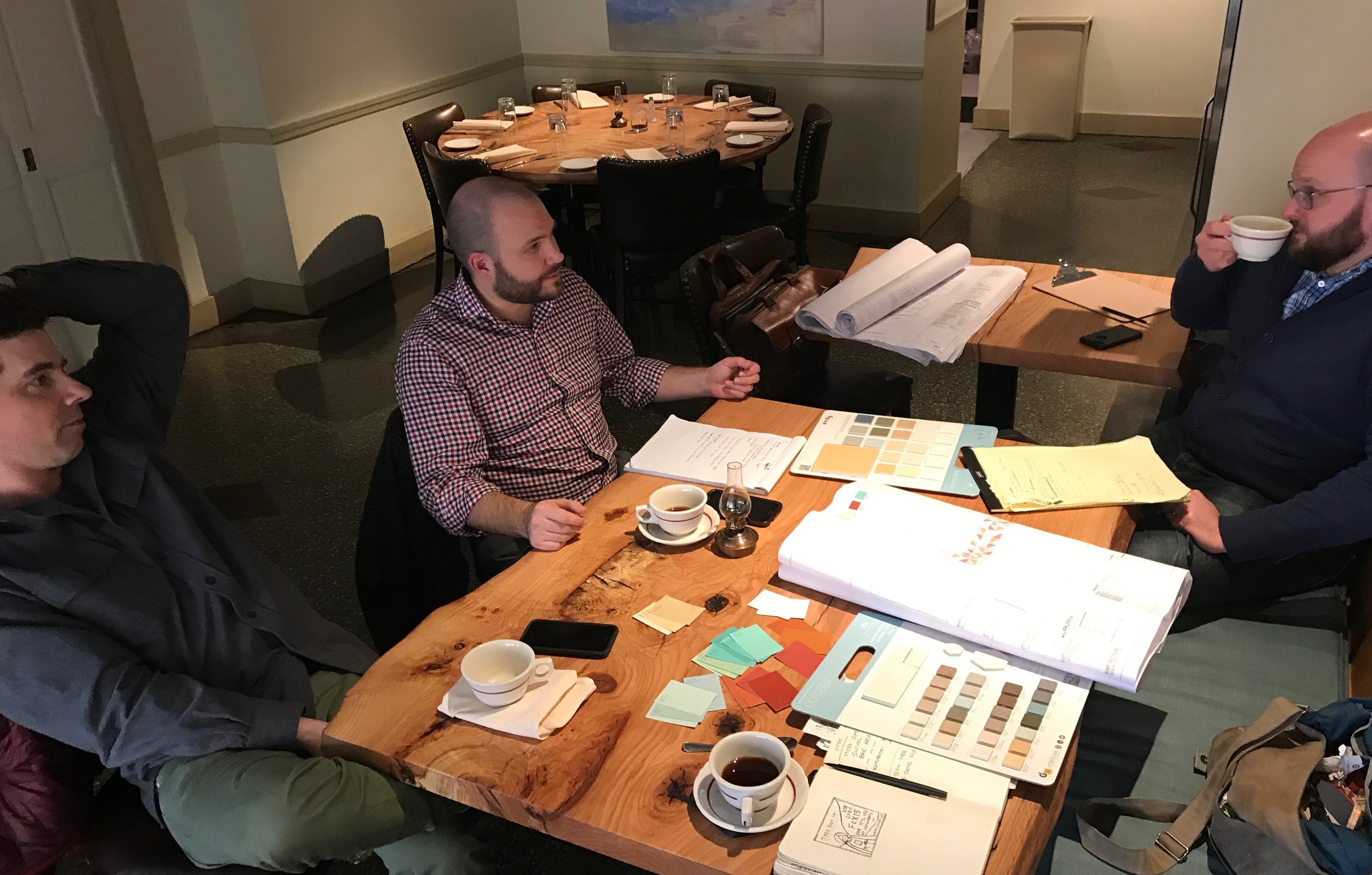
This is Trevett, Will the Architect, and Alex the Manager. These meetings were some of my favorites because they were all about coffee and talking colors, finishes, fabrics, etc.
That original blueprint (that quickly became outdated with all the rounds of revisions and inspections and bureaucracy that goes into renovating a space) stayed with me the entire project.
THIS is when things got super interesting. I love this color palette so hard. Trevett, not so much. It proved to be a great learning experience of working with a client and talking about abstract things like color and feel and vibe and needing to come to a resolution that we’d both be happy with.
MY SKETCHBOOK
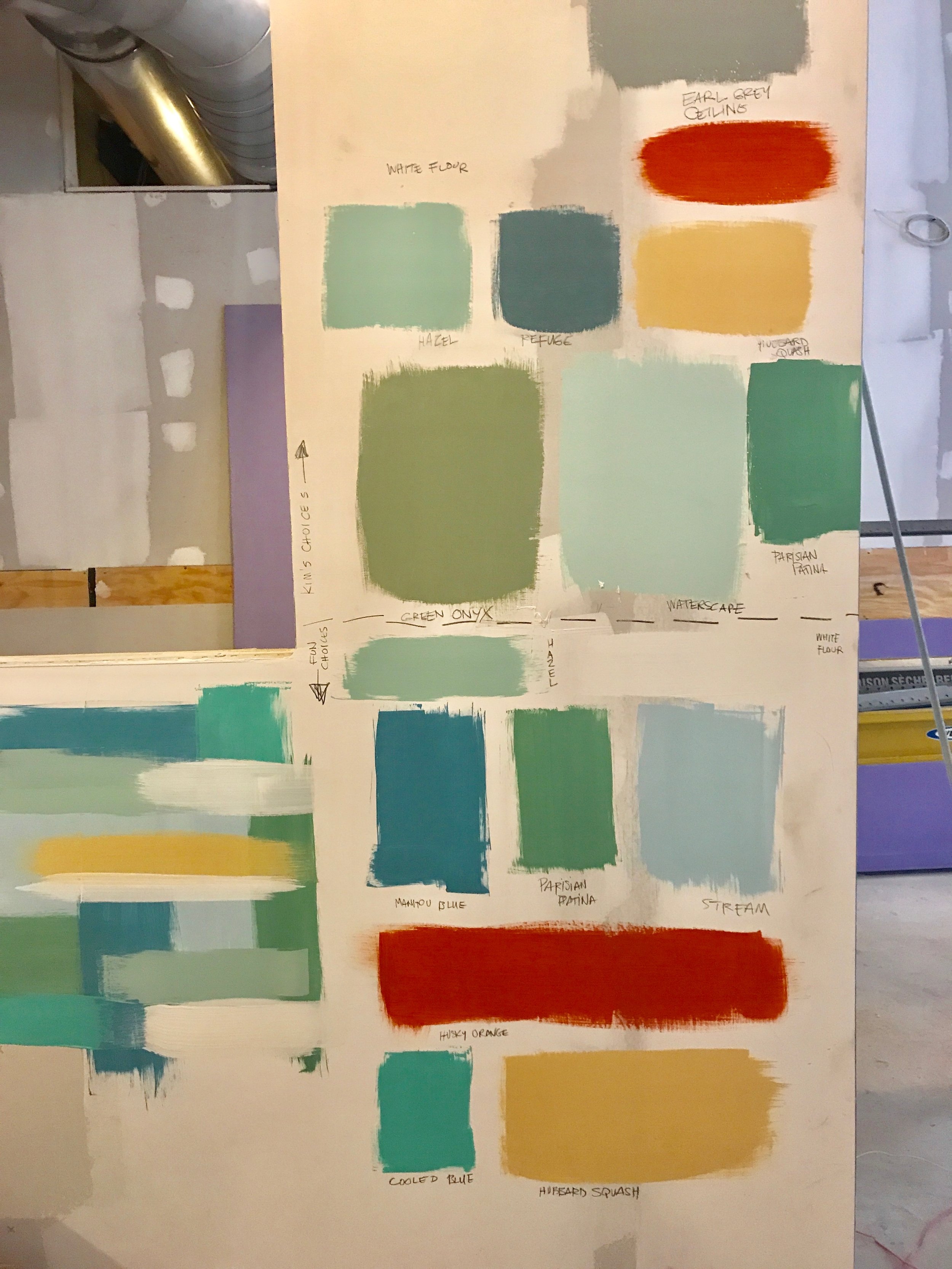
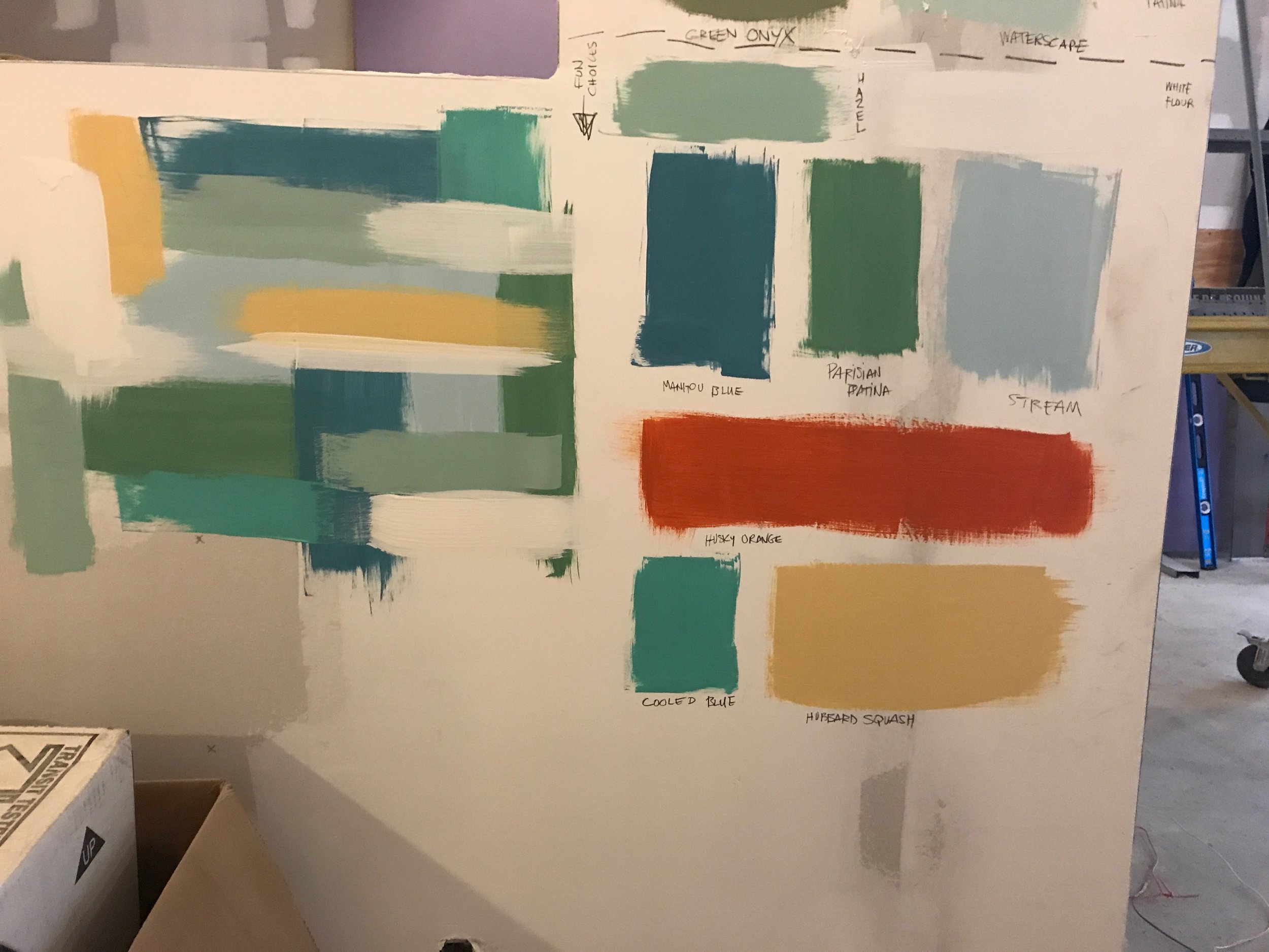
This is me trying to get “fun” (Trevett loves fun, apparently I do not).
Out of control. Too much fun.
I distinctly recall a conversation wherein I said to Trevett, “You want a dive bar-diner-country-cooking-in-the-city-mexican-restaurant and there isn’t a venn diagram where those meet up…”
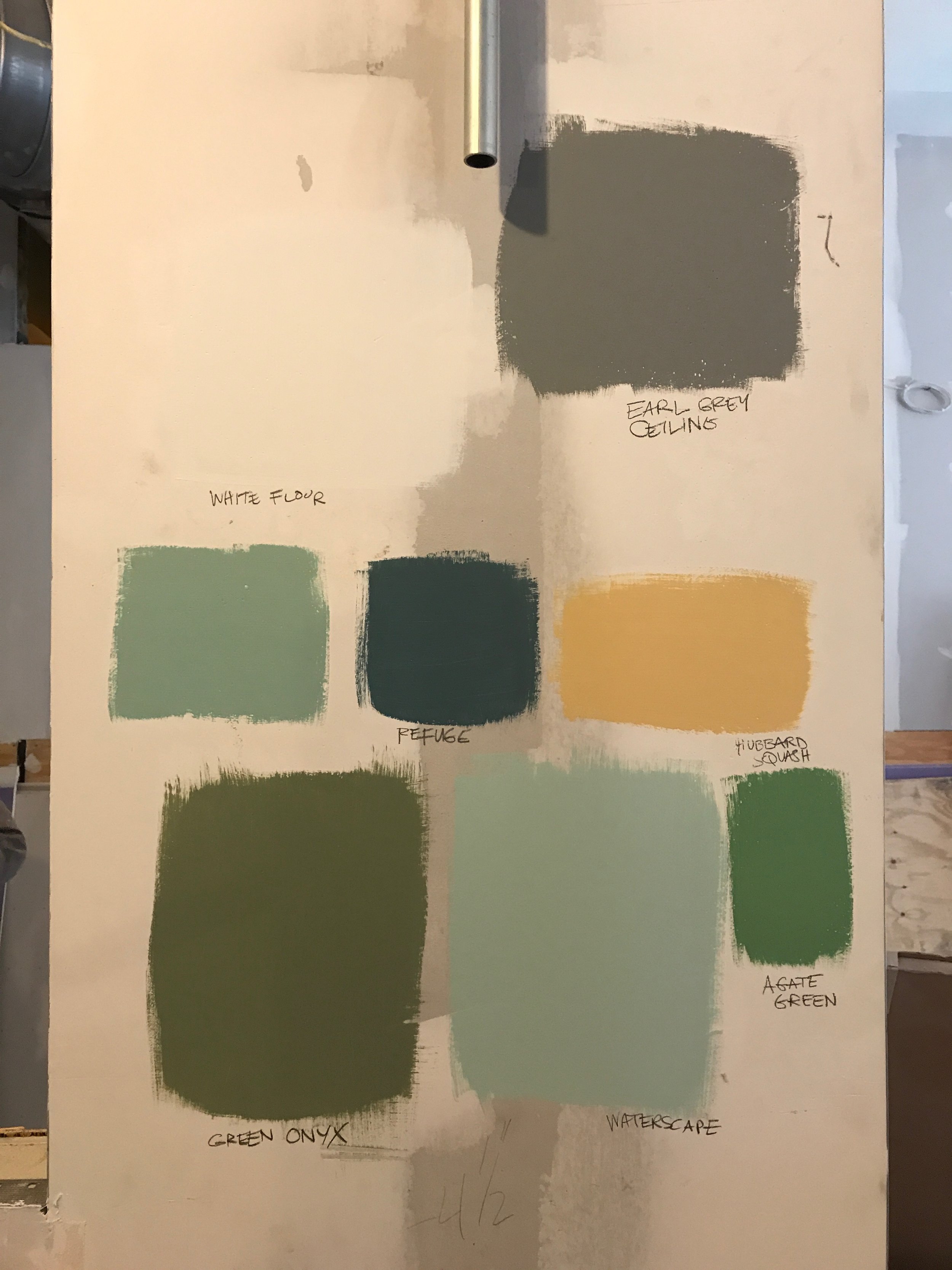
The crew seemed to get a real kick out of me and my many samples and painting swatches all over the walls to see what different light did to the color. And by that I mean they tolerated me and shook their heads a lot. Also they were super stoked that I wanted different colors on all the walls.
This was the official final plan for which walls got what colors and what paint the contractor should buy. There was only one custom color that I had to make and that’s the “Pie For Blue” you see there.
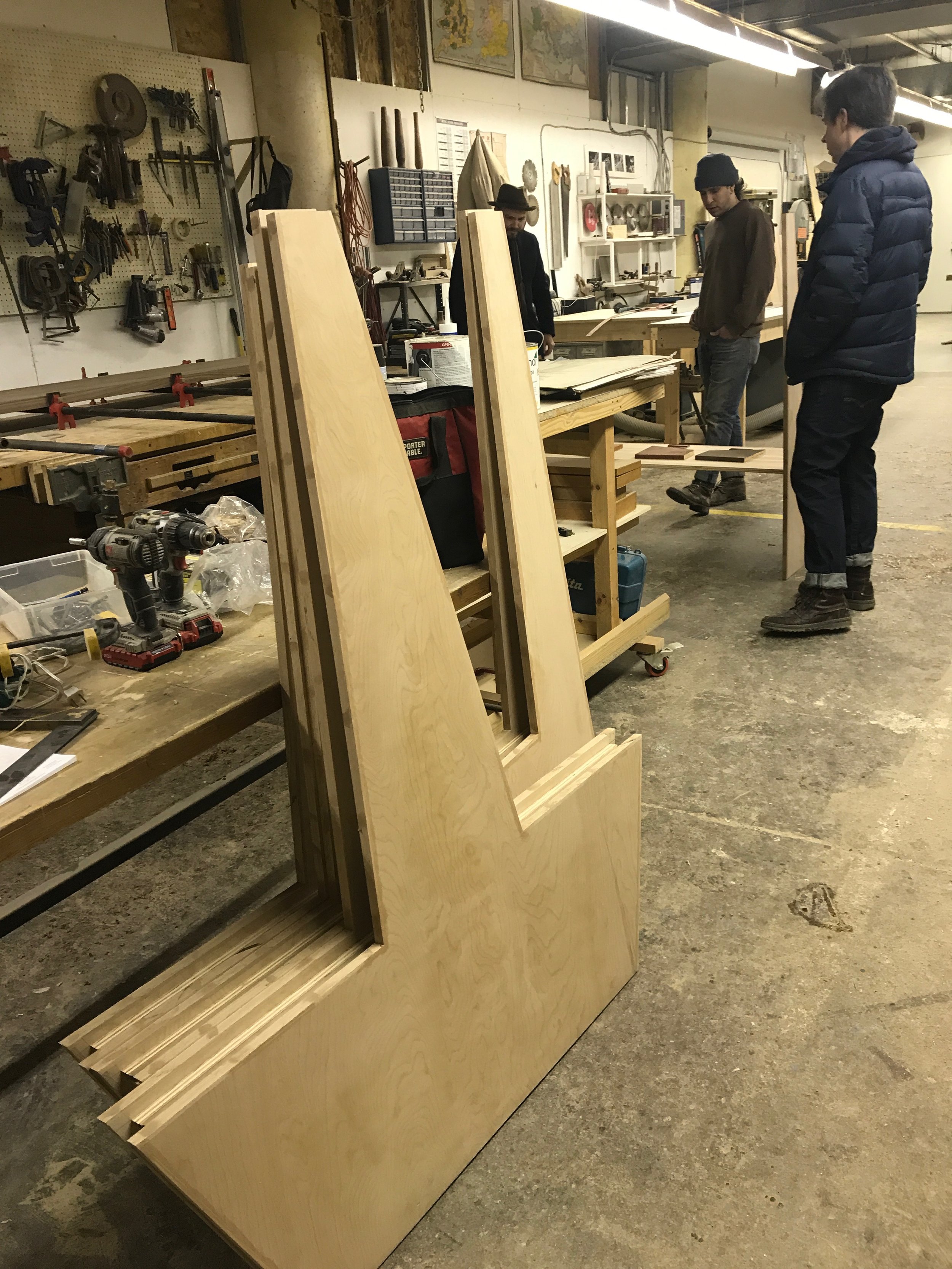
Meeting Steven the Carpenter at his workshop in Manchester to check out the booths, match stains, and discuss tabletops.
Every surface getting it’s own treatment.
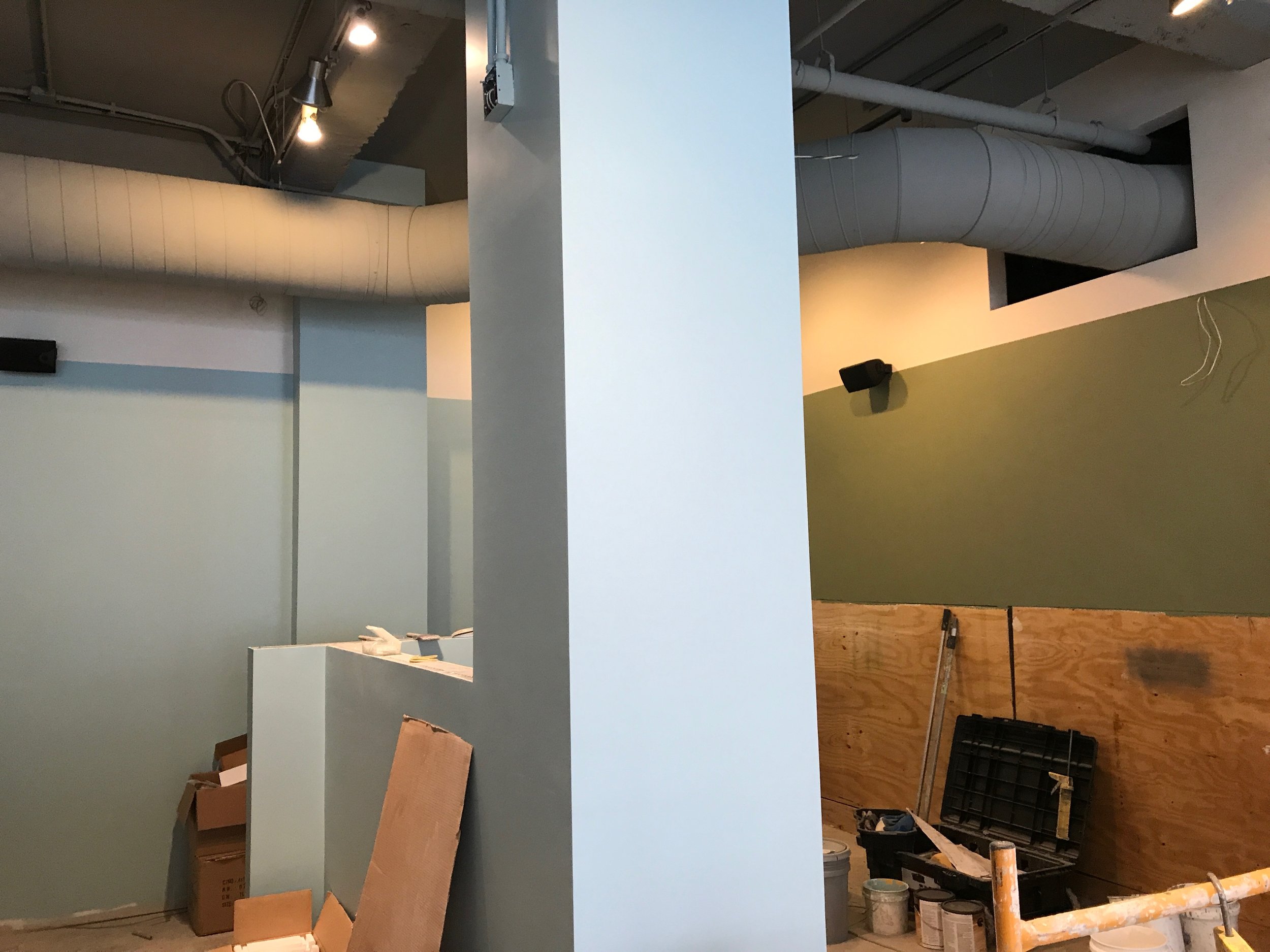
The grey on the ceiling and the ductwork has become my favorite color and I’m using it everywhere now.
Sherwin Williams EARL GREY 7660.
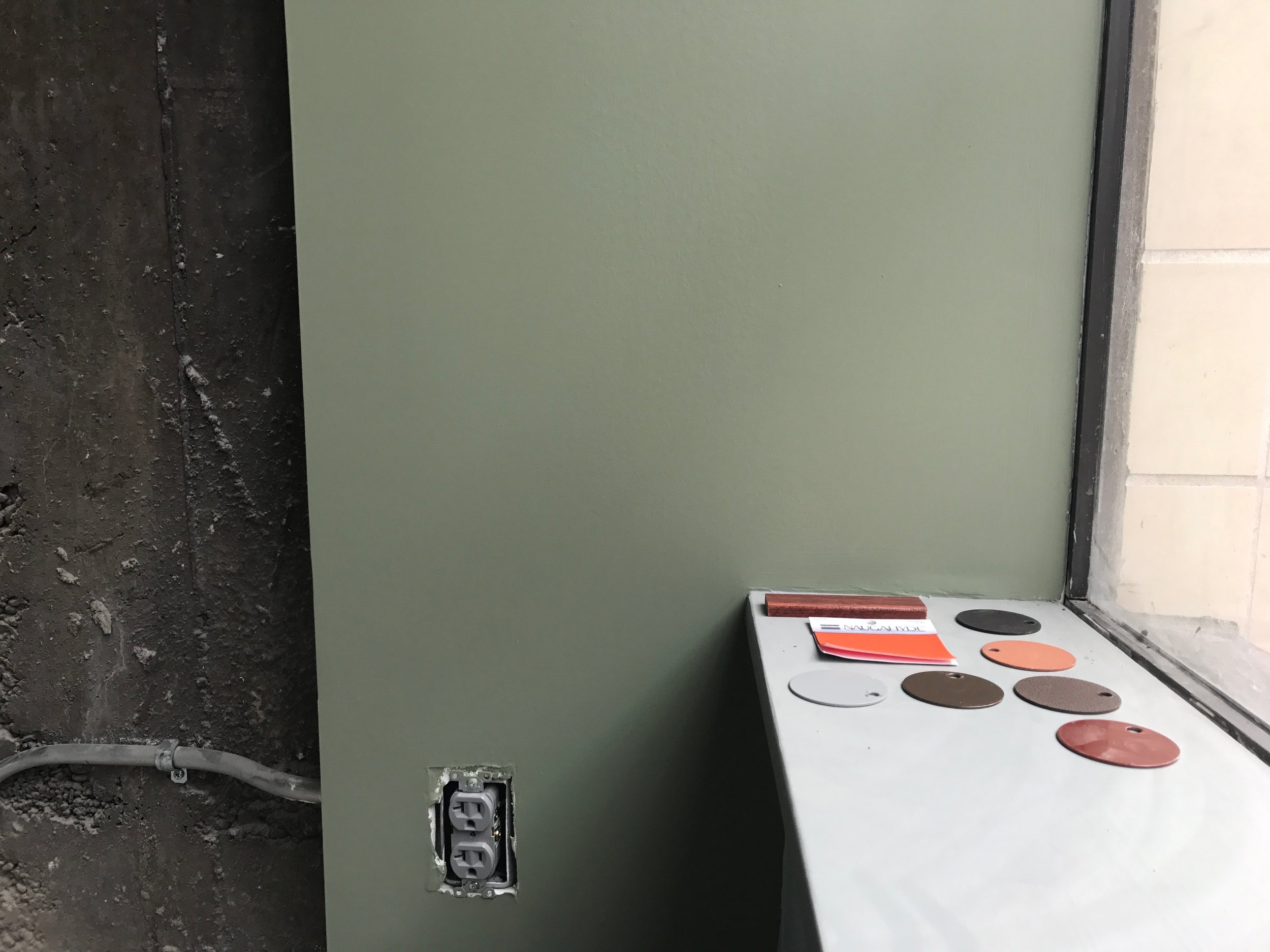
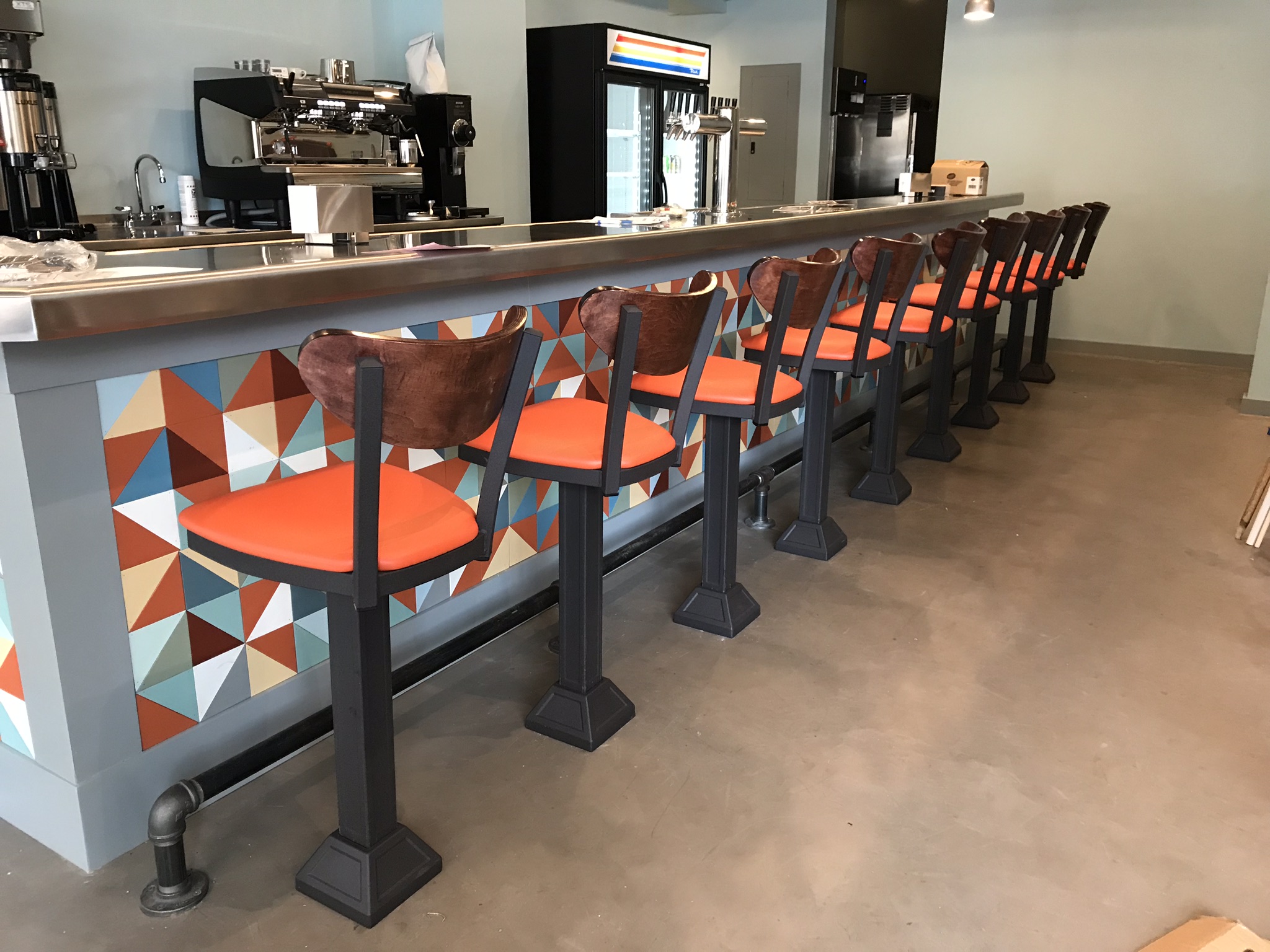
Choosing finishes for the bar stools. I spec’d the wood stain to match the booths, the right orange naugahyde, and the metals. Oh, and make it look good with all the walls being different colors.
When I was a kid I’d collect Formica sample chips. As a grown up I really enjoyed meeting with the reps and going through the samples.
My favorite corner.
Check out how gorgeous those old leaded glass windows are.
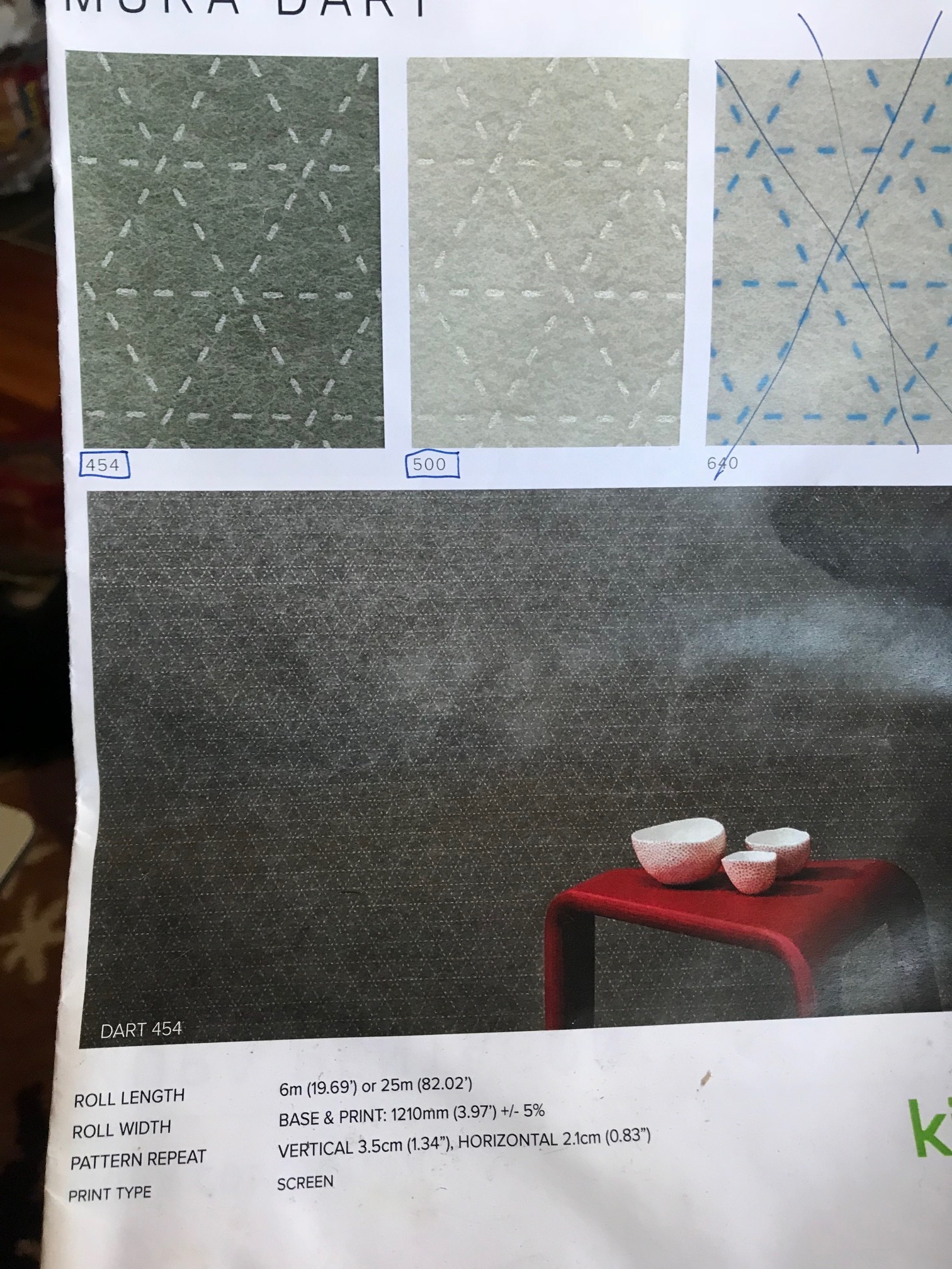
I wouldn’t imagine I’d get stoked about selecting sound panels but then we found these quilted ones and they’re perfect.
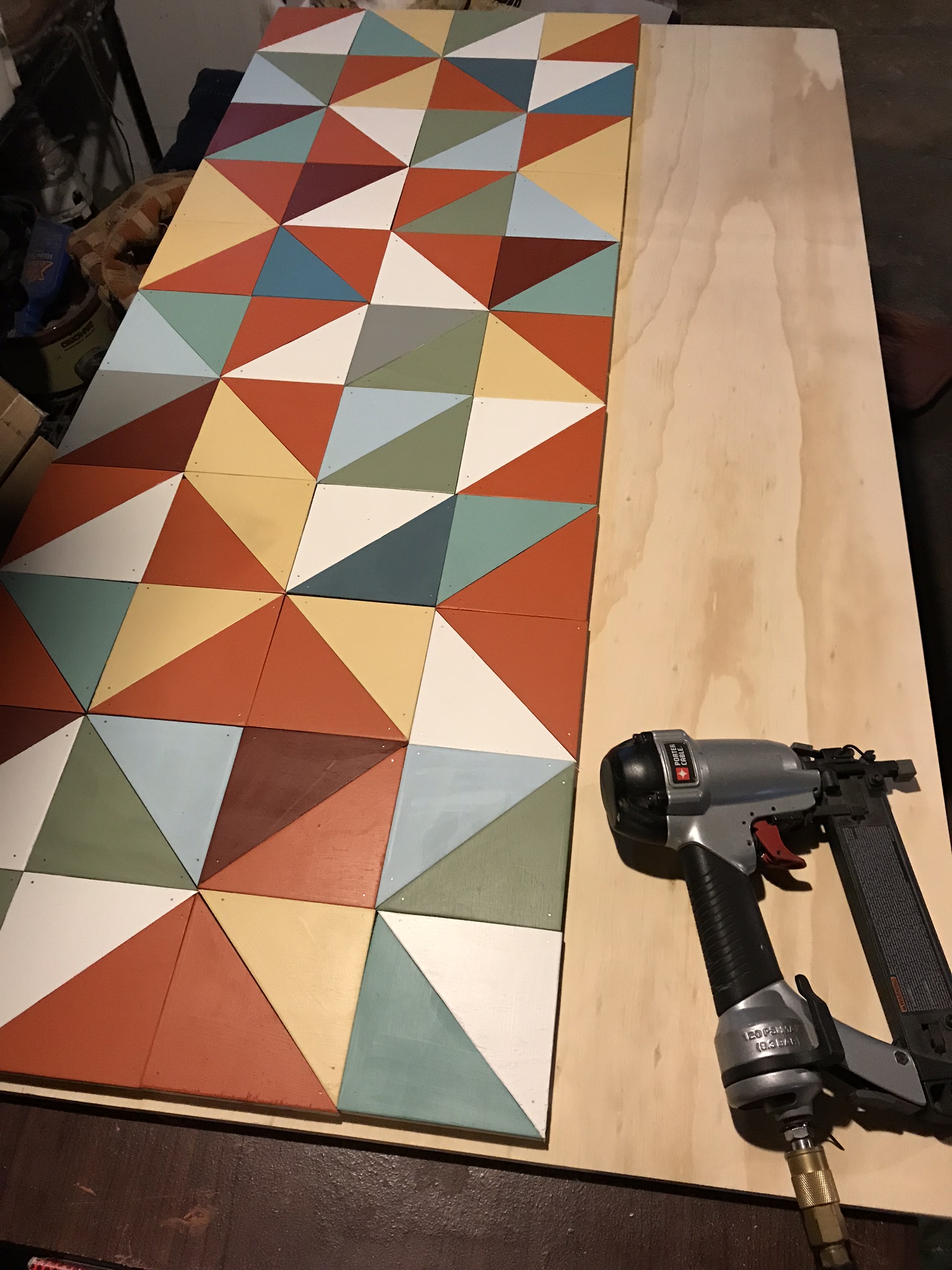
At this point it was time for me to begin actually building the bar front “quilt.”
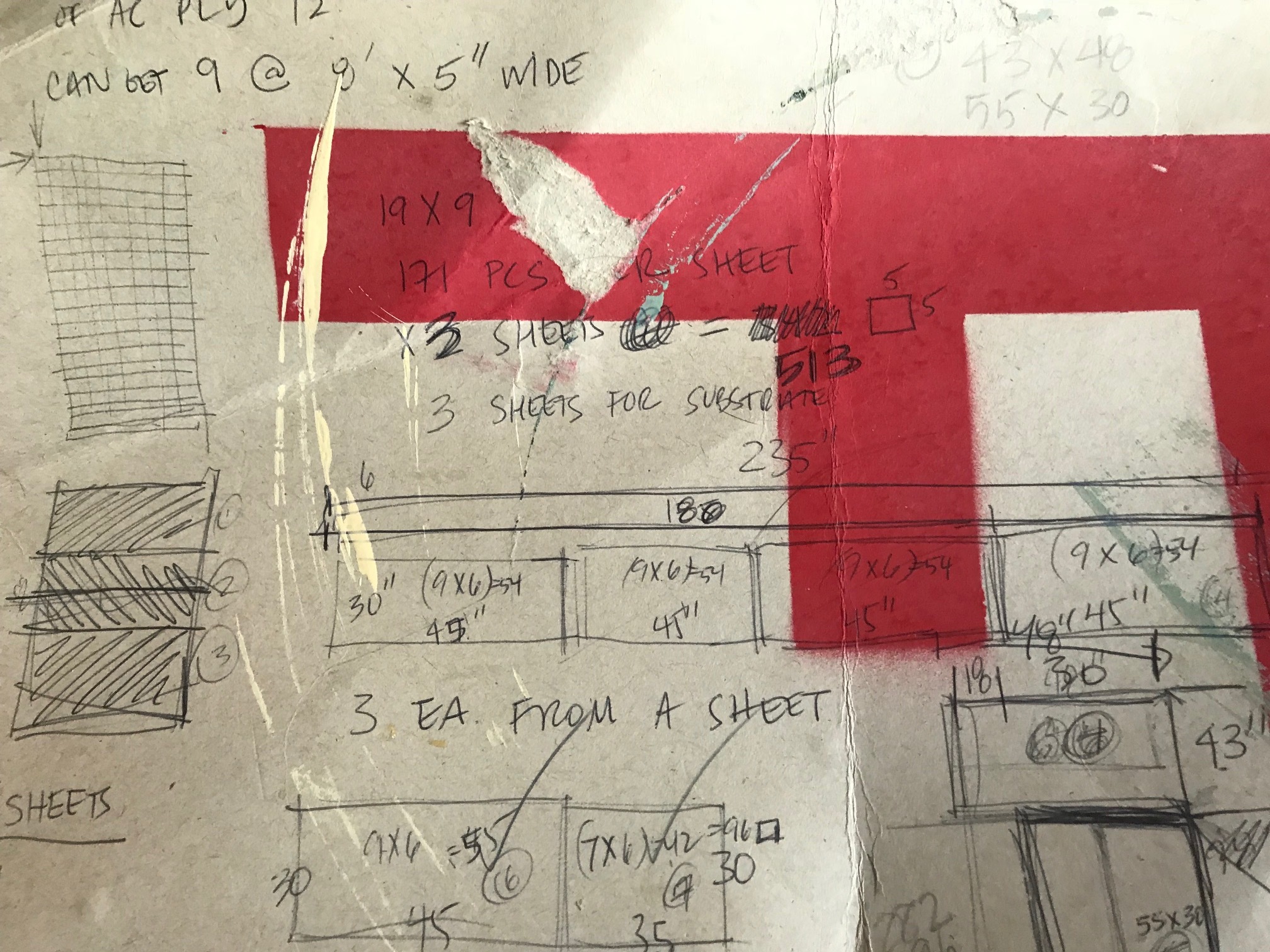
Why I have trouble reading blueprints… this is how my brain plans things.
Setting up shop in the driveway with one of my dogs, Hugo, and the hens.
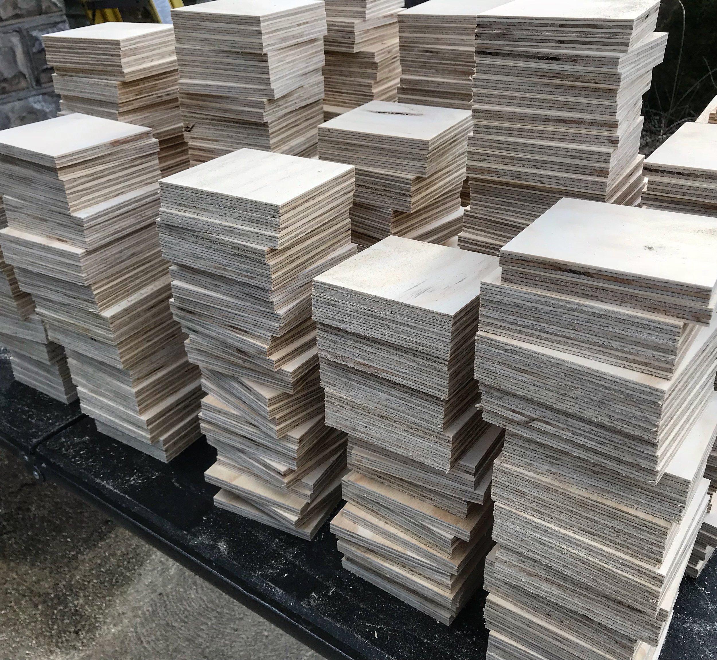
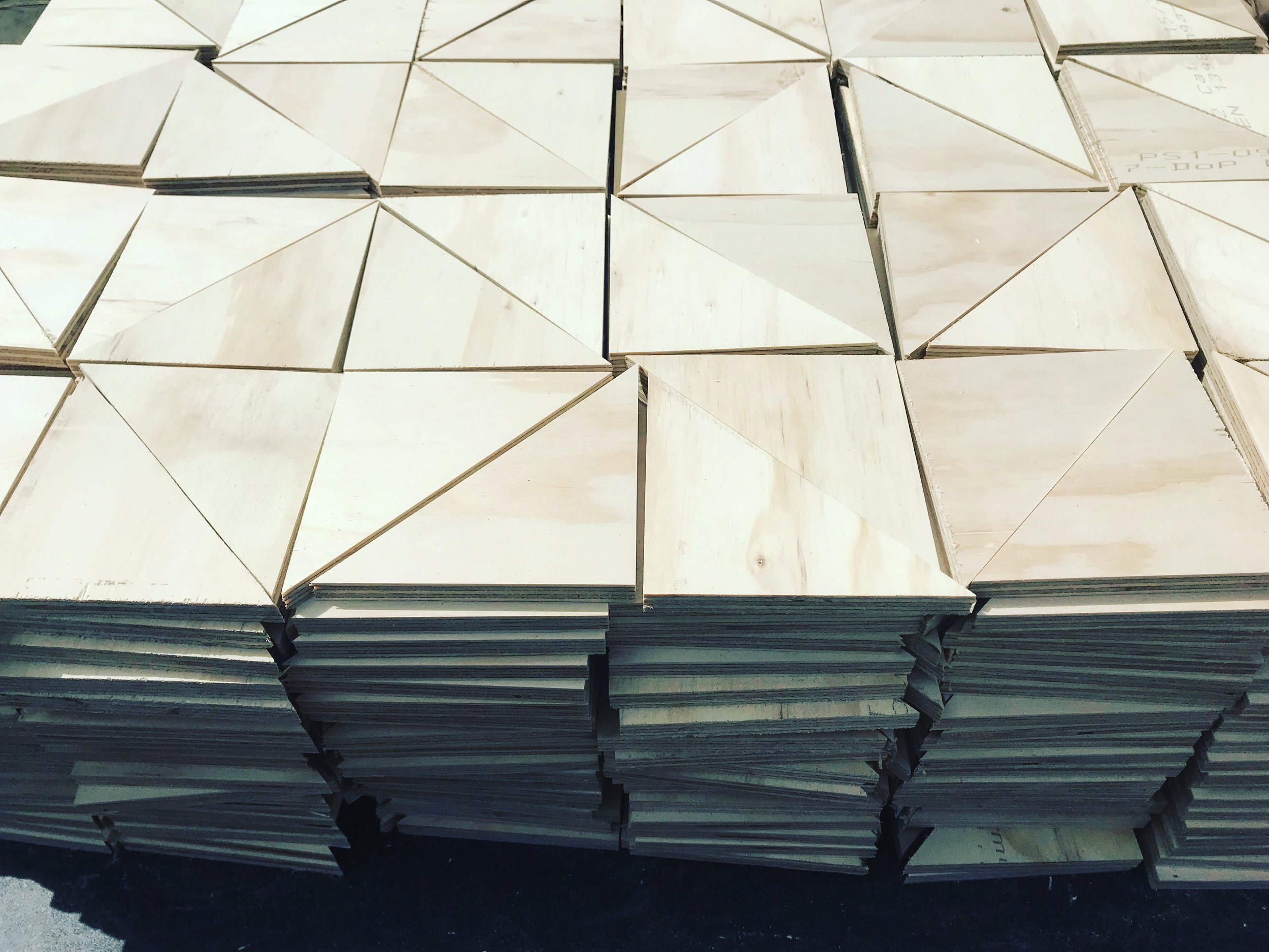
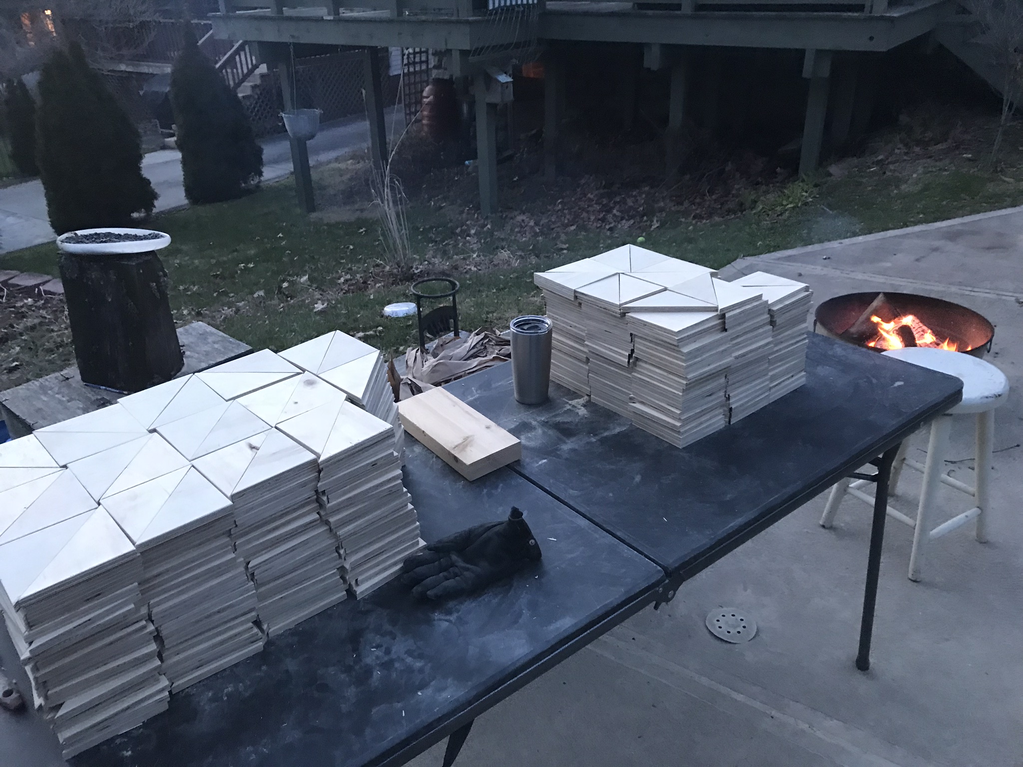
I had to yield 513 squares and then cut those on a 45º angle to yield 1026 triangles - with some overage just in case.
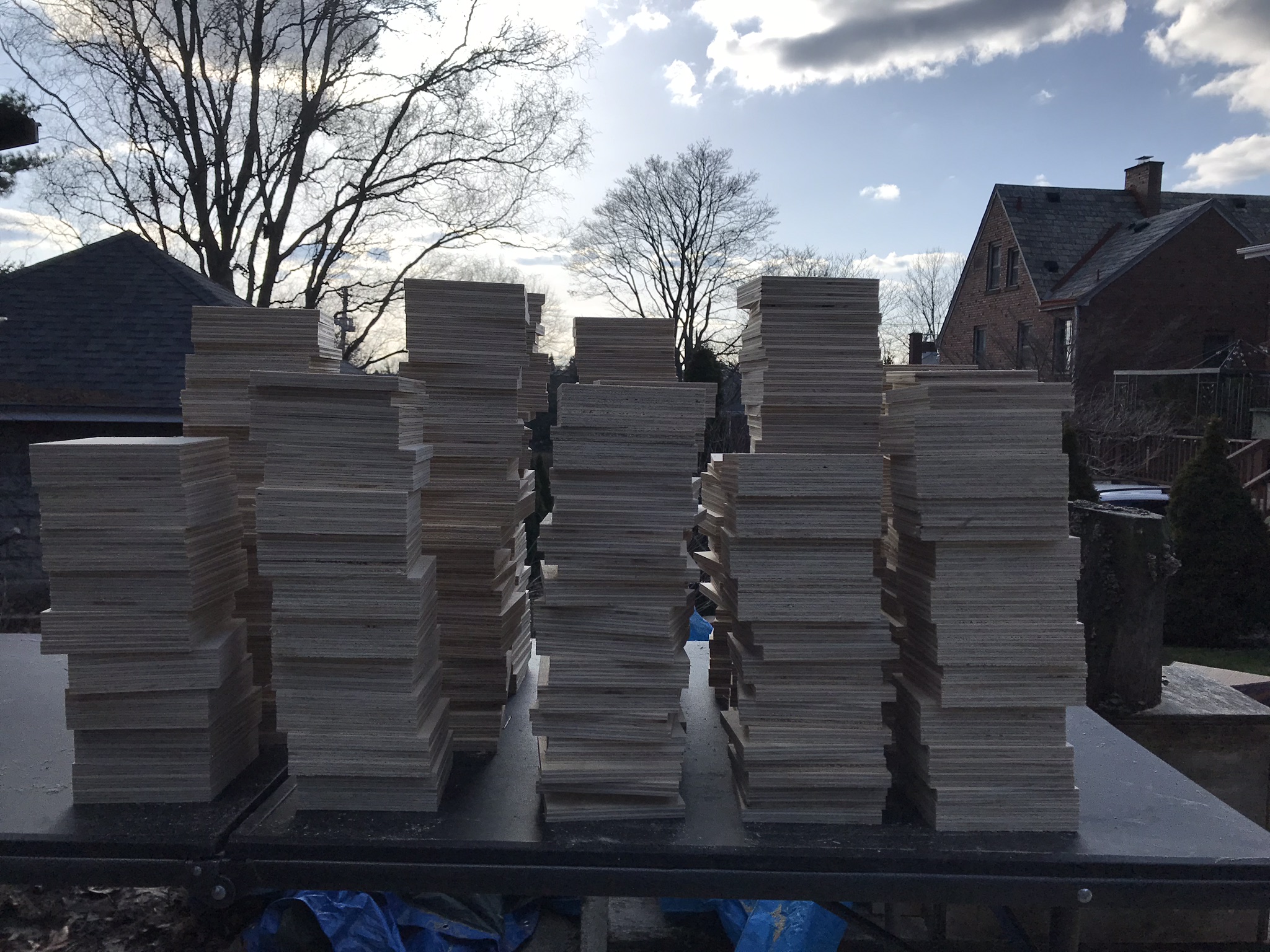
1026+ pieces
My wood shop is in the garage but expands into the driveway when it’s fire-building weather.
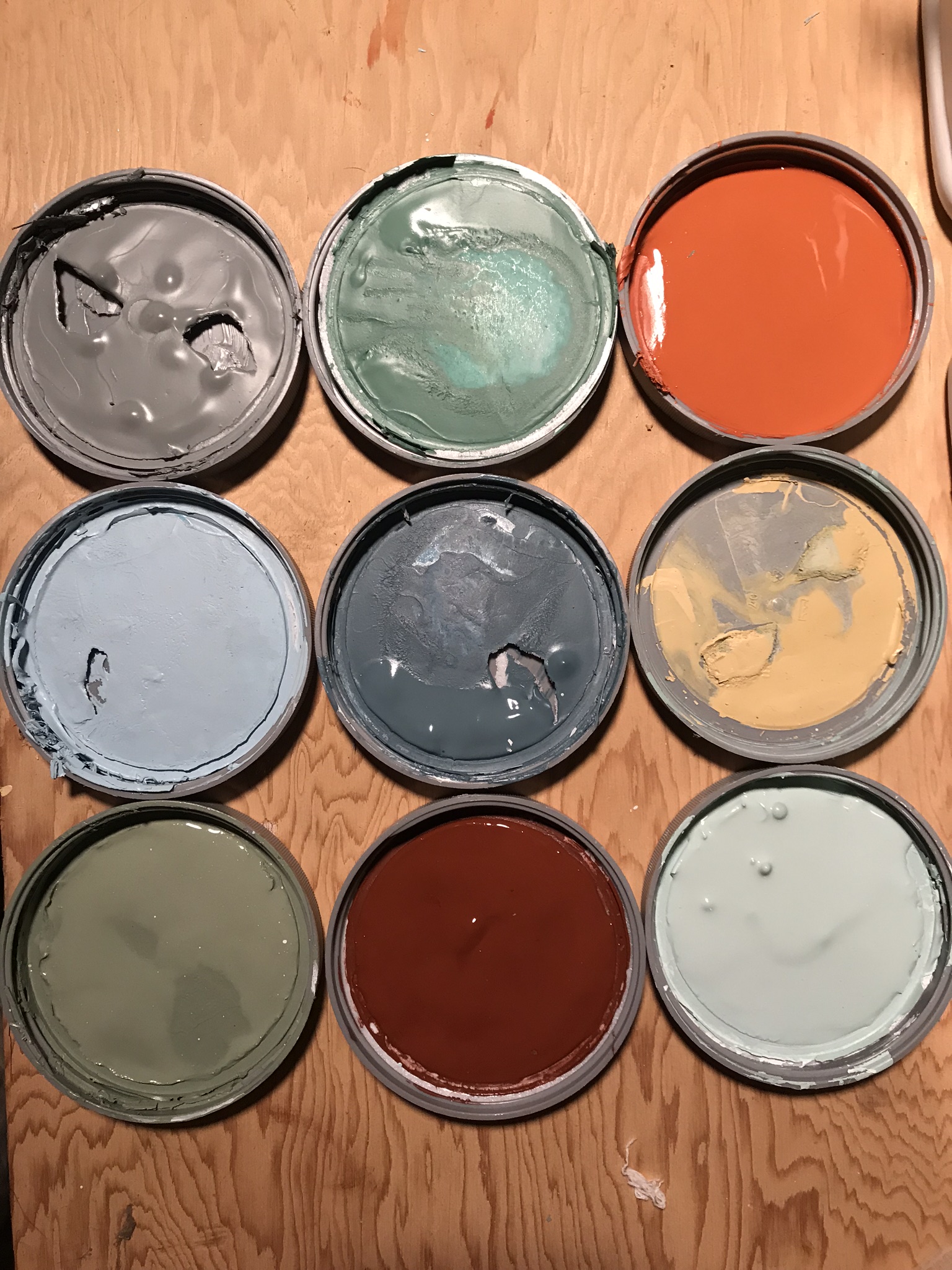
…and there’s that orange.
Always with the color.
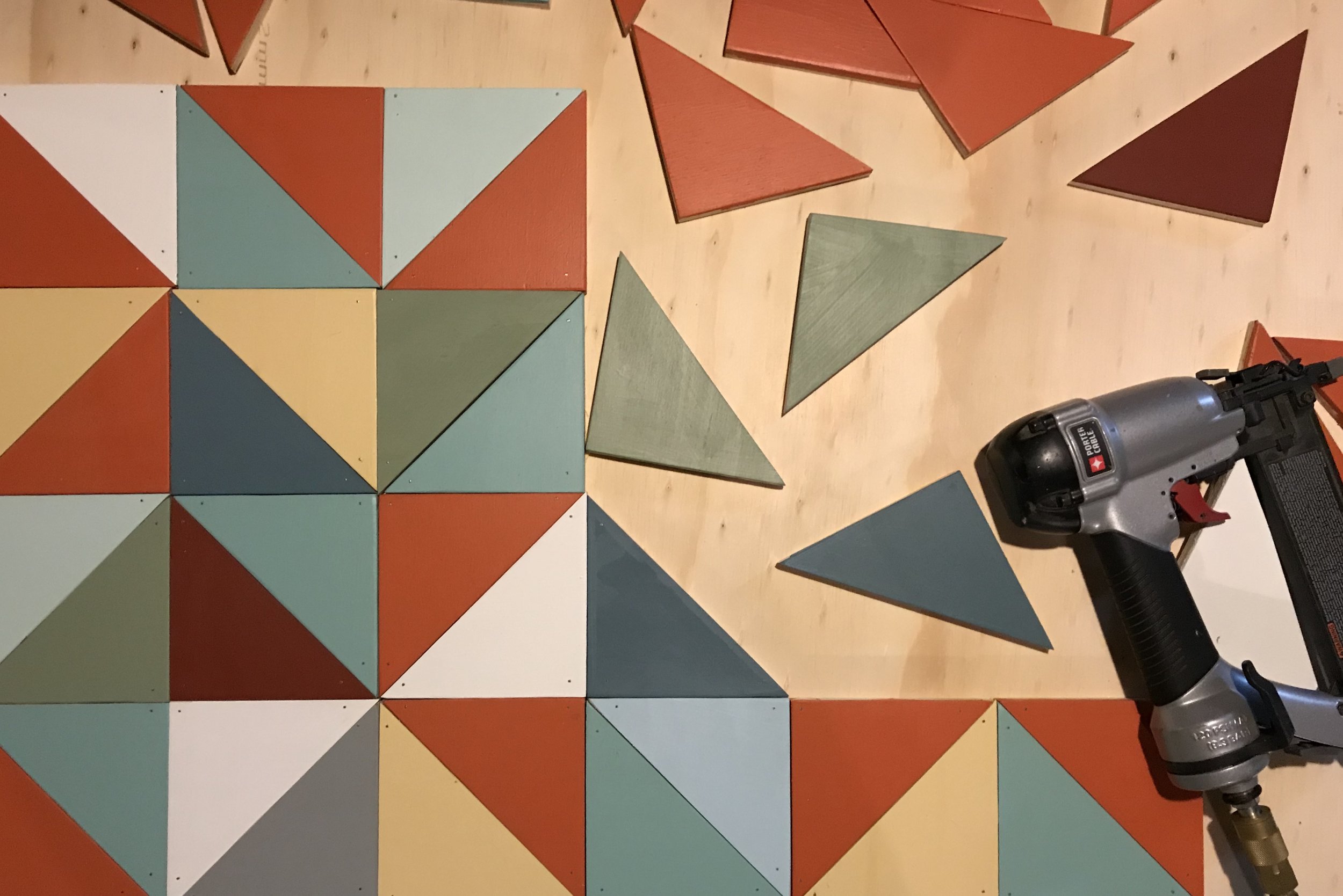
Stacks on stacks of painted quilt pieces ready to be assembled.
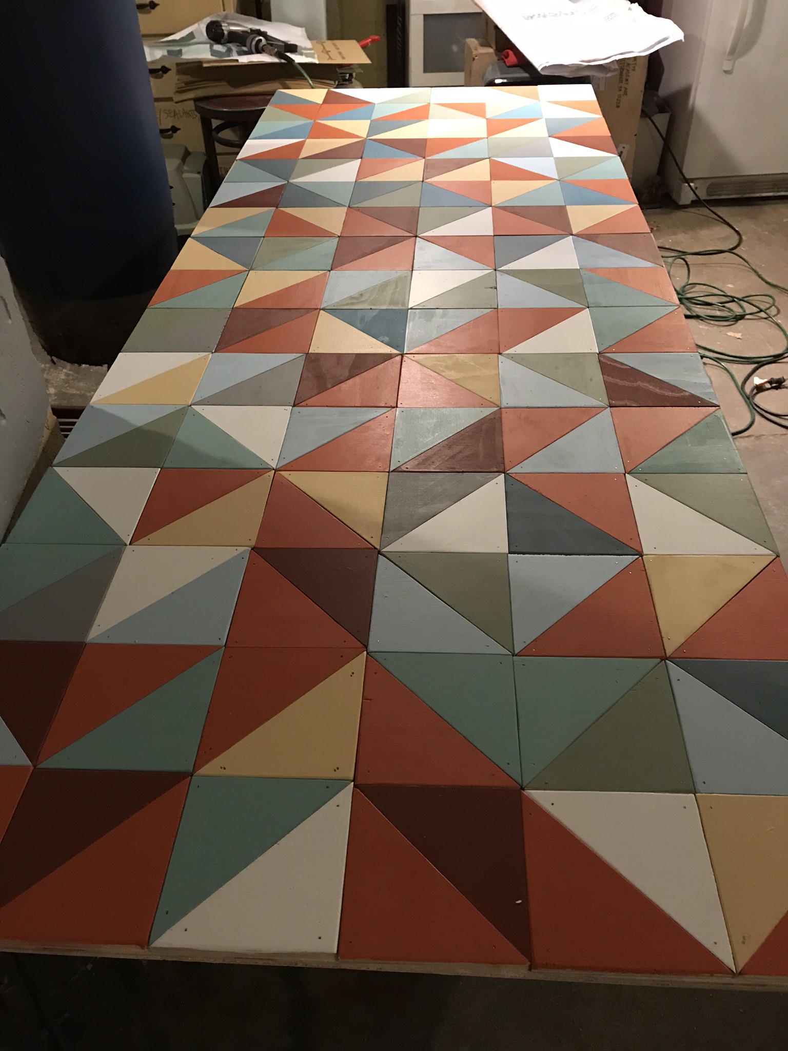
Assembling the panels. I didn’t pre-plan a pattern; I designed as I built.
A finished panel, painted and assembled in my basement.
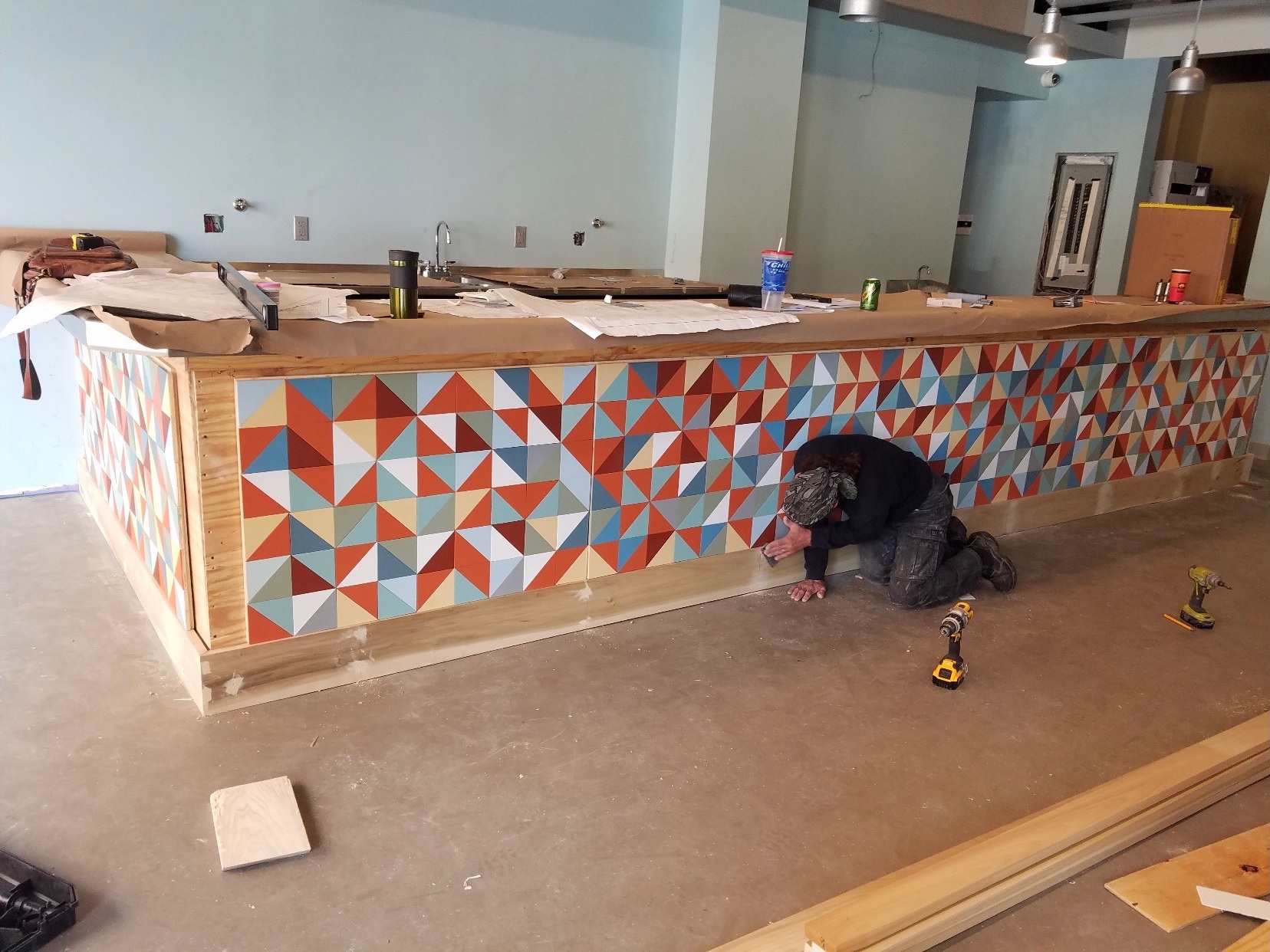
Carpenter trimming out the bar after installation.
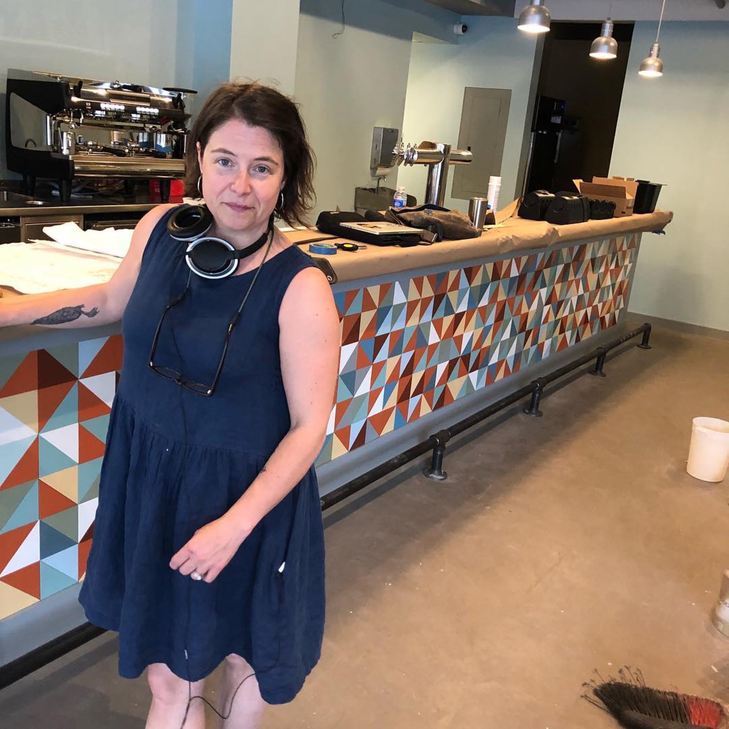
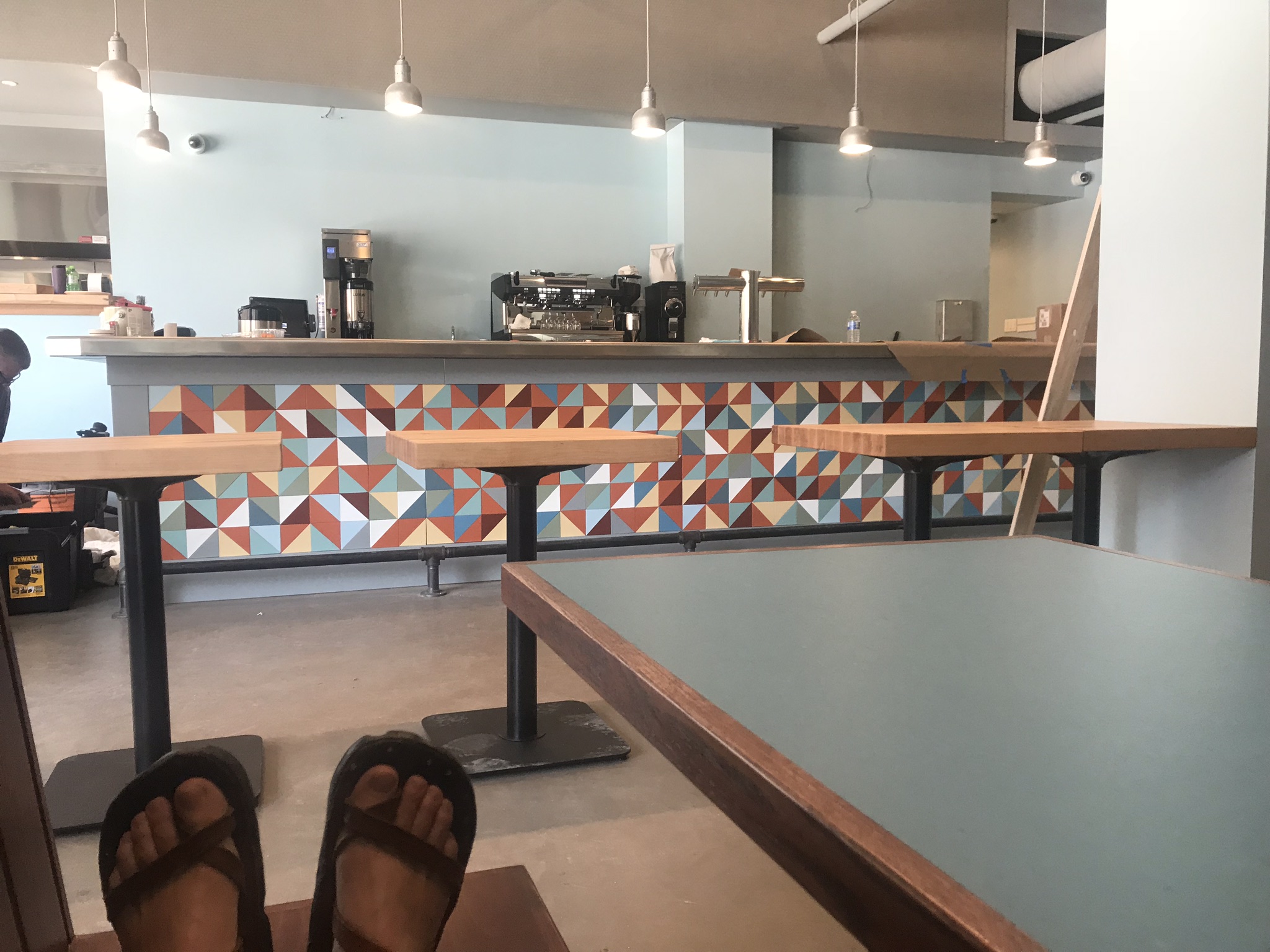
This was such a cool feeling - seeing it in real life after months of conceptualizing it (and weeks of building it).
Trimmed and painted.
Foot rail installed and my turn to poly the whole thing.
One of my three favorite seats in the house. At this point the elements are coming together so nicely - the bar, the walls, the sound panels, the lights, the booths, the tabletops…
Trevett was so glad when the FUN colors started appearing. And I loved seeing the barstools installed.
(FUN) chair delivery day.
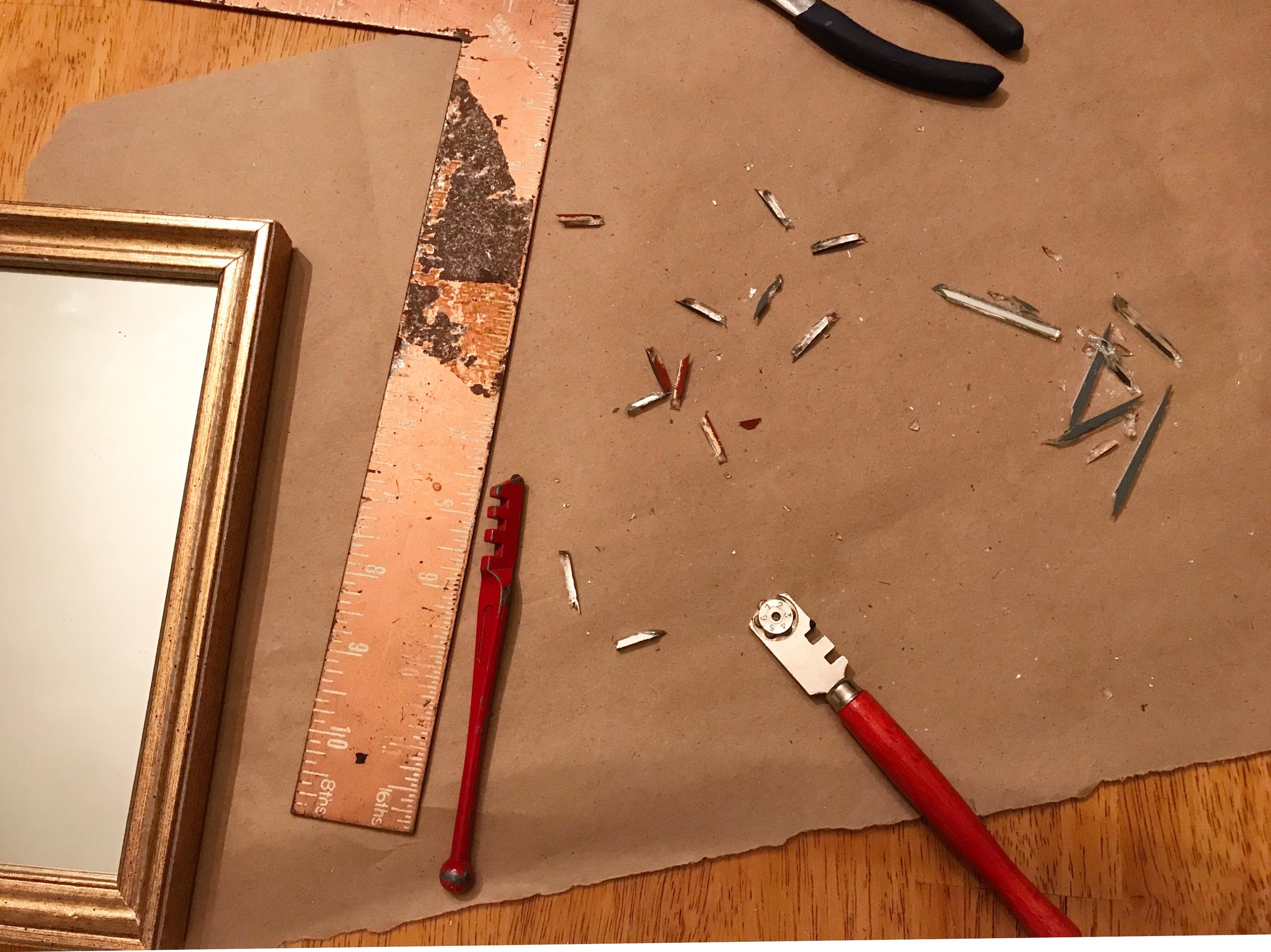
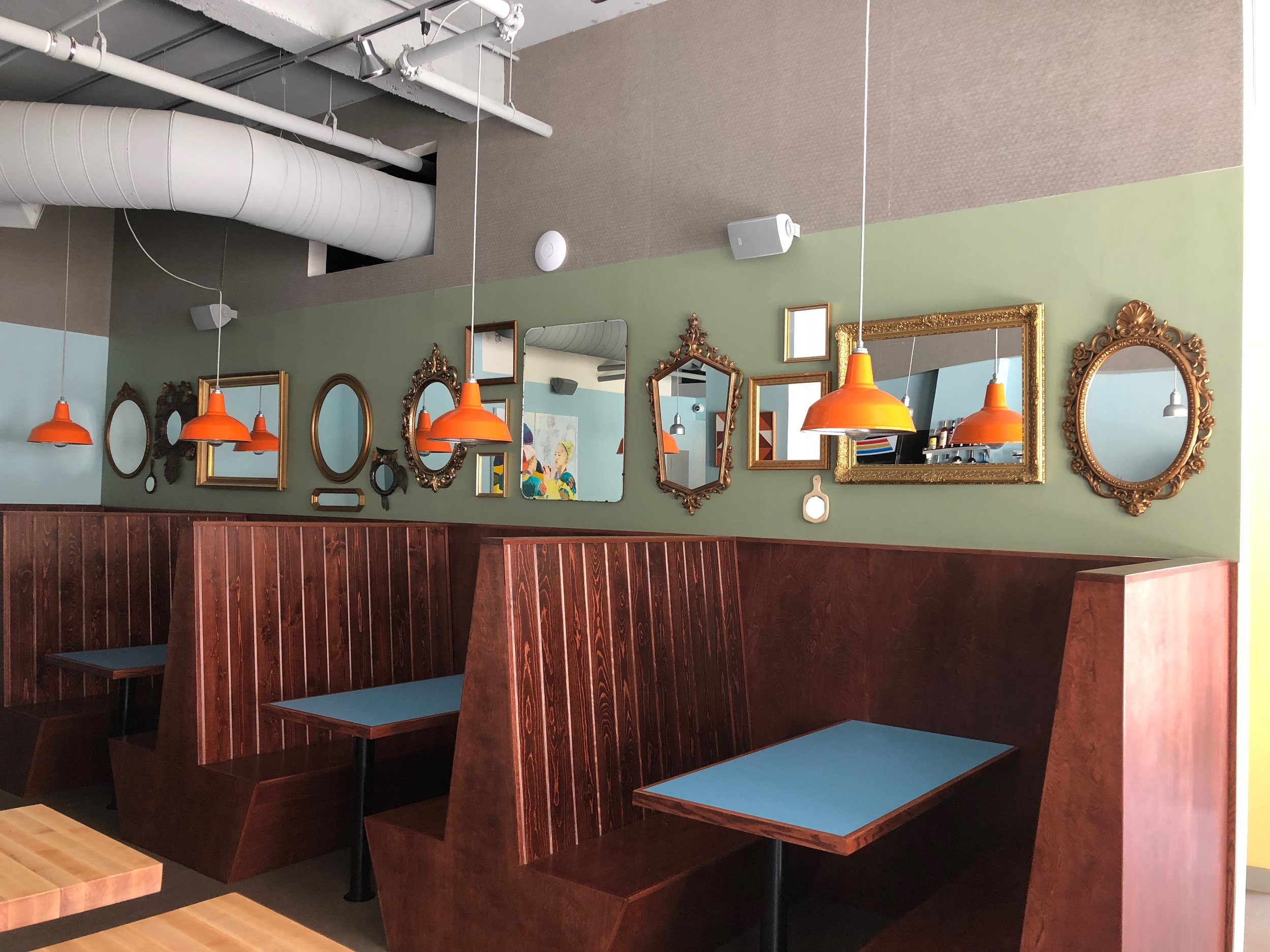
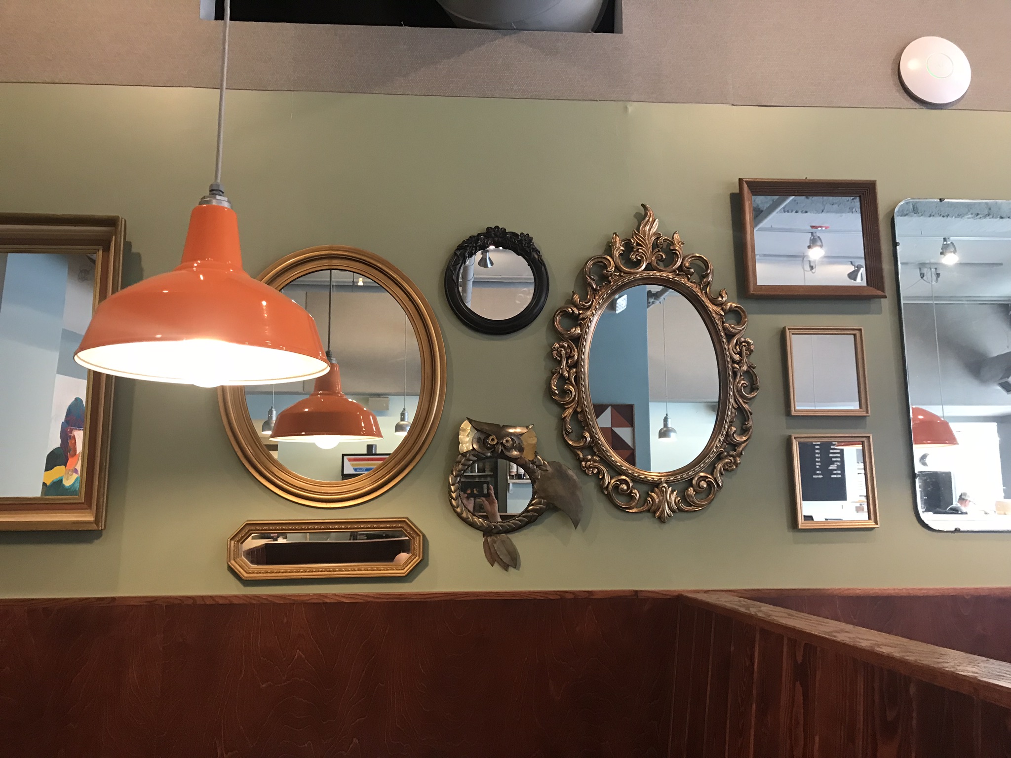
I spent weeks combing estate sales, thrift stores, and junk shops, looking for a mix of mirrors for the big wall. I used to work in a glass shop in Charleston, SC, so I put those skills to work putting mirrored glass in frames I loved.
The first day we started hanging mirrors. I am finally getting over my hatred of wall anchors thanks to this project.
I love how the wall is filling in (and I’m still collecting mirrors).
This makes me happier than you can know. When I look at this I see months and months of work with such a great group of people and this beautiful, fun space where I can go have a slice of pie, a cup of coffee, and then a glass of Prosecco.
Homestyle cooking in the Burgh.